100 Lost Species
100lostspecies.com
Studio
- Animation
- Editorial
- Large type
- Light
- Minimal
Palette
Typography
Primary
UnknownSecondary
Unknown
About this design
An immersive editorial archive that opens in a black void of drifting paper fragments before dissolving into a spacious, filterable field of softly rendered animal portraits.
Prompts
Main build prompt
Build an original immersive conservation/editorial archive, led by this signature: a dark extinction-themed threshold transforms into a white, freeform field of softly rendered wildlife studies. Use the following dimensions and timings as reconstruction targets inferred from the reference, not exact measurements of the original implementation. Compose the desktop experience for a 1920×968 stage (approximately 1.98:1); keep any full-screen raster or transition layer at this ratio, such as 2560×1290 or 3840×1936.

Begin with a fixed, pure-black full viewport. Center a tiny outlined square emblem about 120–150px above a three-line, elegant high-contrast serif headline; write an original headline, not a borrowed one. Target roughly 40–46px desktop type, ~1.02 line-height, normal weight, and restrained tracking. Beneath, place an original two-line mission paragraph in a very small neutral sans, roughly 9–11px and ~1.45 line-height, followed by a sharp white 46×24px entry button. Keep the central stack optically quiet and narrow, around 430–520px wide. Add a small attribution-style line at the bottom center using original credit copy.

Surround the central message with roughly 18–30 dim charcoal paper-strip rectangles. They should form a loose, broken circular orbit approximately 620–880px wide, with varied lengths, slight rotations, and low opacity. They are background punctuation, never a decorative particle effect. Slowly drift/rotate them to create an uneasy archival void.

On entry, use a screen-filling wash from black through smoky grey into #fcfcfc, then reveal the archive. The gallery ground is warm paper white (#fcfcfc), lightly mottled with sparse grey dust, faint grain, and extremely subtle pale beige watercolor blooms (#f2ead5). Keep texture nearly imperceptible: it should read as a scanned paper atmosphere rather than a patterned background. Ink is #000000 and supporting labels are #7f7f7f.

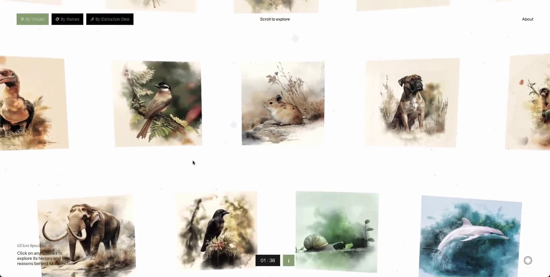
The gallery is a deliberately irregular desktop field of about 15–20 visible square and near-square art prints at once, with additional pieces beyond the viewport. Aim for five loose columns, but do not use uniform cards or equally aligned gutters. Let some prints crop at left/right/top edges. Most tiles are around 145–205px square, while a few vary by roughly 10–25%; vertical offsets should prevent obvious rows. Use original generated or commissioned-style wildlife portraits: small mammals, birds, a dog-like species, an elephant-like animal, and one cool blue aquatic subject are useful diversity cues. Every image needs an aged natural-history watercolor treatment: subdued cream, moss, umber, and foggy blue; quiet paper grain; diffuse painted boundaries; no hard product-photo crop, no captions embedded in the art.

Use a sparse fixed utility layer above the art: an upper-left small square mark plus two-line original archive title, a centered 9–10px “scroll to explore” instruction, and one upper-right utility action. At upper left below the identity, provide three compact 70–105px black rectangular filter tabs, with one active muted-green state. Put a small circular outlined progress/control at the lower-right edge. Add a compact bottom-left explanatory note and an unobtrusive central-bottom index/readout. Labels must use original content.

On pointer hover, slightly brighten or sharpen one image and reveal a tiny black exploration tag near its upper portion; reveal a centered muted-grey two-line specimen caption below it. On activation, transition into a detail mode: retain the off-white field and utility layer, replace filters with a close action, and isolate one approximately 280–360px square illustration near the horizontal center and upper-middle of the viewport. Put the original common-name-style title beneath in elegant serif around 14–18px, then a smaller Latin-style secondary line. Leave the rest deliberately empty.

Use DOM images, CSS texture layers, and transform-based animation; a practical implementation can use GSAP for the crossfade, compositional rearrangement, and hover timing. Load a low-resolution placeholder first, then decode and fade full images in. Respect reduced motion with a direct, short opacity transition into a stable gallery and no drifting fragments. Ensure tab buttons and tiles are keyboard accessible, have visible focus rings, meaningful alt text, and a non-hover path to each detail view.

Do not add generic feature sections, large navigation bars, rounded cards, drop shadows, testimonials, marketing gradients, oversized statistics, or a standard masonry feed. The restraint, paper-like emptiness, and cinematic black-to-white transformation are the identity.
Create a free account to unlock all prompts
These prompts describe a visual language: composition, rhythm, type scale and motion. Build with your own branding, copy, logos and imagery — the design and content of 100 Lost Species belong to their authors.
Build Recipe
Framework
- React
Creative tools
- Nano Banana
Libraries
- GSAP
Special requirements
AI Replicability
86 / 100
Main remaining challenge
The design and branding of 100 Lost Species belong to their authors. InspoToCode documents its visual language as a reference; anything you build from it should carry your own branding, copy and assets.
Design analysis
- Square imagery and sharp-cornered controls; avoid rounded-card treatment.
- Tiny black rectangular filter tabs with white type; active tab turns muted sage/green. The opening action is a compact white rectangular button with black text.
- No card containers. Individual square or near-square art prints float directly on the paper-like page with ample irregular space.
- Almost none; imagery relies on pale painterly feathering rather than UI elevation.
- Minimal to absent. The opening icon sits in a faint, thin square outline; controls use solid fills rather than outlined pills.
- Very generous whitespace, with roughly 5–9vw separation between portrait centers in the desktop gallery; compact utility labels.
- Full-bleed 1920×968 reference stage. Header utilities sit around 28–32px from the side edges; gallery intentionally crops at viewport edges.
- Sparse utility navigation: small identity at upper left, a centered scroll instruction, one utility link at upper right, and a small circular progress/control at lower right.
- A coherent collection of square, warm, watercolor-like animal studies: washed paper, soft edge blooms, desaturated natural hues, and occasional cool aquatic scenes.
- No decorative CSS gradients. Use subtle cloudy paper texture and the illustration’s organic fading edges instead.
- A freeform but disciplined multi-column portrait field, not a uniform card grid. The opening screen is centrally stacked and surrounded by a loose ring of dark rectangular fragments.



