Akke Knitwear
akkeknitwear.com
Ecommerce
- Editorial
- Large type
- Light
Palette
Typography
Primary
Humane GrotesqueSecondary
Inter
About this design
An apparel storefront that treats shopping as a paced fashion editorial: cinematic outdoor portraits, oversized condensed labels, muted utility-colour fields and a product grid move between campaign-scale moments.
Prompts
Main build prompt
Use the following dimensions and timings as reconstruction targets inferred from the reference, not exact measurements of the original implementation. Build an original fashion-commerce homepage whose signature is the alternation of full-bleed outdoor knitwear campaigns, gigantic ultra-condensed labels, and quiet sage-green catalogue fields. At the 1920×968 reference composition, begin with a roughly 100vh hero photograph: a model in a textured knit is framed from torso upward against dark rust-coloured rock. Make the image cover the stage at approximately 1.98:1, preserving a deliberately editorial crop rather than trying to show the full body. Overlay a very small all-caps navigation bar about 24–40px from the top and 50px from both sides. Use your own simple starburst-like symbol plus wordmark, collection links, account/cart labels and language selector. Add tiny shipping or service text close to the upper edge, but use original wording.

Place an original two- or three-word campaign heading at visual centre in white ultra-condensed uppercase display lettering, approximately 100–145px high at desktop, with very tight line height around 0.82–0.95. It should overlap the model and be the dominant graphic element. Use a condensed display face resembling Humane Grotesque; set all interface and metadata in Inter or a neutral sans serif. Place sparse left/right carousel arrows near the horizontal middle, and a small white pagination dot toward the right. Keep controls light, plain and functional.

After the hero, transition into a muted sage page ground (#9aa499). Create an approximately 100vh editorial collection module with two portrait-to-landscape photographic tiles, around 340–450px wide each, positioned high and widely apart: one near the left gutter and one nearer the right side. Overlay each image with a large condensed category label. Leave the central area intentionally empty. Near the lower-right, add a fixed-looking circular outlined scroll-direction control about 52px across, with a small filled triangular chevron. This control should reverse direction at the end of the page.

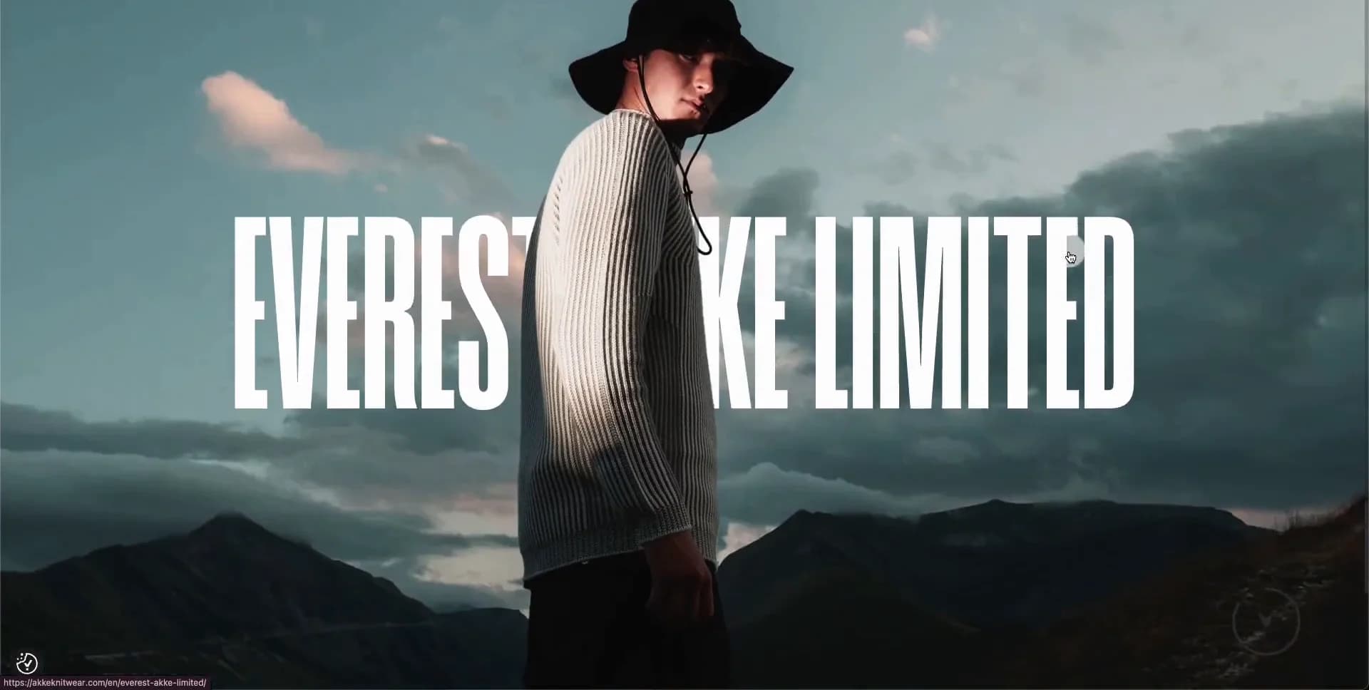
Follow with a pale near-white product shelf. At desktop, display four equal columns, each with a tall clipped model/product image, a centred condensed uppercase product name, a small one-line description and a price. Use a generous gap around 24–36px and only roughly 20–50px of side inset. Do not put products inside rounded cards, do not add shadows, ratings, badges, quick-shop buttons, coloured CTA buttons or a generic feature grid. Beneath the shelf, use an enormous low-contrast condensed heading announcing the next product edit, partly cropped by the viewport, then interrupt the page with another approximately 100vh campaign image: an original model in a dark brimmed hat against a moody blue-grey mountain sky, with a massive white condensed slogan stretching behind or across the figure.

End with a sage newsletter/footer section about 75–100vh tall. Its top row pairs a bold condensed heading and small explanatory text on the left with a very long, thin, rounded outlined email field on the right; use placeholder text and a right-aligned arrow. Below, create three compact all-caps link columns. Put legal text low at left and retain the circular up control low at right. Use #1c130b for ink, #fcfcfc for light surfaces, #dadada where a pale separator field is useful, and photo-led rust, orange and blue-green accents only inside imagery. Prefer semantic DOM, responsive images and CSS layout/transforms; no canvas or WebGL is needed. Use accessible text labels for icon-only controls, visible keyboard focus, meaningful image alt text, lazy-load below-the-fold images, and reserve image dimensions to prevent layout shift. Keep all brand copy, logos, campaign wording and photography original.
Create a free account to unlock all prompts
These prompts describe a visual language: composition, rhythm, type scale and motion. Build with your own branding, copy, logos and imagery — the design and content of Akke Knitwear belong to their authors.
Build Recipe
Framework
- WordPress· Detected
- WordPress
Creative tools
- Nano Banana
- Krea
Special requirements
AI Replicability
86 / 100
Main remaining challenge
The design and branding of Akke Knitwear belong to their authors. InspoToCode documents its visual language as a reference; anything you build from it should carry your own branding, copy and assets.
Design analysis
- Primarily square image edges; utility controls use fully round ~50px outlined circles and the email field is a long pill.
- Minimal text links and a persistent outlined circular down/up control with a solid directional chevron; no filled primary CTA treatment.
- Products are presented as borderless columns on a near-white ground, with cropped model images above centred names, short descriptions and prices.
- No visible elevation shadows; hierarchy comes from scale, crop, contrast and large areas of empty ground.
- Fine, low-contrast outlines define the email input and circular navigation control; imagery is unframed.
- Deliberately spacious editorial rhythm: large vertical pauses between modules, wide margins and tightly grouped product metadata.
- Full-bleed campaign sections; internal content uses roughly 50px desktop side padding with image tiles floating inside a broad field.
- A very small uppercase top bar overlays the opening image, split between logo, collection links, account/cart utilities and language.
- High-contrast fashion campaign photography in rocky terrain and alpine landscapes; portrait crops, tactile knit detail, subdued warm grading and full-bleed editorial framing.
- No decorative gradients are apparent; tonal depth comes from photographic sky, rock and cloth texture.
- A full-viewport hero gives way to an asymmetric two-image collection module, a four-column product shelf, a full-screen campaign interruption, then a large newsletter/footer field.



