Attio
attio.com
SaaS
- Animation
- Large type
- Light
- Minimal
- Monochrome
Palette
Typography
Primary
interSecondary
interDisplayMono
JetBrains Mono
About this design
A revenue CRM landing page that pairs an unusually restrained, spacious editorial hero with a large, continuously changing product workspace demonstration.
Prompts
Main build prompt
Create a light, premium landing page for an original revenue-operations SaaS product. Use the following dimensions and timings as reconstruction targets inferred from the reference, not exact measurements of the original implementation. Preserve the wide reference composition at 1920×968 (≈1.98:1) for the captured desktop stage.

Lead with the signature: a nearly all-white, editorial hero with enormous breathing room, ending in one large browser-like CRM workspace that appears to rise out of a faint blue-lilac glow. The app window is not supporting decoration; it is the hero image and should occupy roughly 1,500px wide by the time it reaches the lower half of a 1920px desktop viewport. Let its bottom continue below the fold.

Build a full-width black announcement strip around 50px tall at the top, with a short centered message in ~14px white type, a tiny right arrow, and a quiet close icon positioned near the right inset. Under it, place a 72px white navigation bar with a #E7E9ED bottom hairline. Use an original geometric symbol plus your own lowercase wordmark at left. Set four to five ~16px navigation links across the left-middle; two can have small downward chevrons. On the right, use a compact outlined sign-in-style button and a compact near-black filled primary button. The content width should be about 1,400–1,500px, with nav alignment matching the app frame.

Start the hero after approximately 100px of clear air. Center a small white promotional capsule, roughly 300px wide and 32px high, with a 1px pale-gray border, fully rounded ends, ~14px text, a small arrow, and a delicate 1–2px blue-to-green moving underline visible only along part of its bottom edge. Leave about 42px before the headline. Use Inter Display where available for an original two-line-or-less statement, around 70px desktop, weight 600–700, tight tracking around -0.055em, and a line height near 0.98. Keep the headline ink close to #1E2026 and its max width around 950px. Do not reuse any wording, name, or logo from the reference.

Place a centered support paragraph about 34px beneath the headline: ~20px, line-height ~1.25, medium gray-blue #737D8E, with a constrained width near 650px. Add two side-by-side CTAs around 28px below it: an outlined white secondary and a near-black primary, each around 118–132px wide by 39px high with 10px rounding. Keep the visible hero intentionally sparse: do not add partner-logo strips, statistical counters, gradients across the whole page, feature-card grids, testimonials, floating geometric ornaments, or oversized shadows.

Begin the lower demo roughly 80px after the CTAs. Behind it, add a low-contrast lower-stage field beginning around the lower quarter of the screen: a vertical white-to-very-pale #DCE6FF/lilac wash, with very fine translucent vertical lines. It should be just visible at the edges, not a graphic backdrop competing with the product.

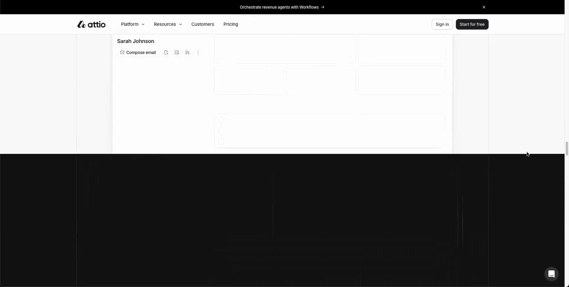
Create the product demo as a semantic DOM UI rather than a raster screenshot or canvas. Frame it as a broad desktop macOS-like application window with roughly 14px corner radius, an almost imperceptible border, and a broad soft shadow. Its top strip is pale #F4F5F7 and about 35px tall; use three small red, amber, and green traffic dots at upper left. Beneath it, show a CRM shell: a ~290px left sidebar and a white main work area divided by hairline borders. The sidebar includes a small square app mark, workspace name, utility controls, and a compact vertical list. Use concise original labels, simple line icons, and active-state pale gray fill.

Animate the main content region through three believable original states while keeping the outer frame, sidebar, and top chrome fixed: (1) a company-table view with row dividers, blue domain chips, colored status pills, avatars, tiny AI badges, and a few pending cells rendered as pale blue thinking text; (2) an AI workspace with a right-aligned gray request bubble, a typed-looking response heading, and one meeting/event card; (3) an automation/workflow run view with an ultra-faint dotted canvas and a right run-history panel. Use genuine in-app density, around 5–7 visible records or run rows, but keep text secondary to layout. One outer frame with shifting internal content is the central experience.

Use CSS transitions and ordinary DOM rendering for this reconstruction; canvas is unnecessary unless it genuinely improves the subtle background treatment. Keep all controls keyboard reachable, use 44px touch targets on touch layouts, respect reduced motion with a stable selected workspace plus gentle opacity rather than a constantly changing demo, and ensure gray labels meet readable contrast. Use preloaded fonts, reserve demo dimensions to avoid layout shift, and pause hidden/inactive demo rendering where practical.
Create a free account to unlock all prompts
These prompts describe a visual language: composition, rhythm, type scale and motion. Build with your own branding, copy, logos and imagery — the design and content of Attio belong to their authors.
Build Recipe
Framework
- React
Creative tools
- Nano Banana
Libraries
- D3· Detected
Special requirements
AI Replicability
93 / 100
Main remaining challenge
The design and branding of Attio belong to their authors. InspoToCode documents its visual language as a reference; anything you build from it should carry your own branding, copy and assets.
Design analysis
- Mostly small, practical rounding: roughly 8–12px buttons and chips, ~14px for the product window, and ~20px on the cookie notice.
- Compact pill-like controls with ~13–15px labels; primary action is near-black with white text, secondary is white with a thin cool-gray outline.
- Avoid a card-grid aesthetic. The principal surface is one very wide browser-window mockup with a pale header strip and a fine border.
- Extremely restrained: the product window has a soft, broad low-opacity lift; floating cookie notice has a slightly stronger diffuse shadow.
- Fine #E7E9ED-like hairlines define navigation, product chrome, table rows, chips, and outlined buttons.
- Large vertical whitespace drives the hero. Tight 8–16px internal UI spacing contrasts with roughly 40–80px gaps between hero elements.
- Desktop content is centered in a wide container around 1,440–1,540px; the app demo is slightly narrower and centered below the hero.
- A black announcement strip sits above a 72px white navigation bar. Brand sits left, text links center-left, and two compact account/action buttons sit right.
- No photographic hero art. Product UI is the visual asset: a crisp, high-density application scene framed like a macOS window, emerging from a subtle cool glow.
- A very faint blue-to-lilac vertical glow and narrow vertical lines bloom behind the lower product frame; the main hero remains visually flat white.
- Single-column, center-aligned hero. A small promo capsule, oversized headline, constrained supporting copy, paired CTAs, then an oversized app demo whose lower portion intentionally extends below the viewport.



