Bunta Beer
buntabeer.com
Consumer Brand
- Animation
- Editorial
- Large type
- Light
Palette
Typography
Primary
Degular VariableSecondary
Redhatmono Variablefont Wght
About this design
A consumer beer brand site that pairs a warm cream ground, pink can photography, oversized black display type and playful label-like information blocks into a polished scrolling product story.
Prompts
Main build prompt
Use the following dimensions and timings as reconstruction targets inferred from the reference, not exact measurements of the original implementation.

Build a consumer beverage-brand editorial site around one defining idea: a pale-cream, full-width vertical story in which an isolated pastel-pink can, vivid flash-food photographs, oversized black headlines and irregular sticker-like fact blocks take turns occupying the centre. At the reference desktop stage of 1920×968 (about 1.98:1), keep the shell #ececc8, with near-black #040303 ink, powder-pink #d7a8cc product/surfaces, raspberry #d20044 highlights and acid-yellow-green tags. Do not use gradients, glass panels, feature-card grids, testimonial carousels, stock lifestyle hero imagery, or soft SaaS-style shadows.

Set a persistent top bar about 40–54px tall: a small uppercase mono text nav aligned to the left, your own outlined retro wordmark centred, and one compact acid-yellow rounded purchase button at right. Keep a thin black vertical partner/credit tab around the right midpoint as a secondary edge detail. Use a heavy, tight grotesk display face for headings—roughly 58–82px at desktop for central statements, 34–46px for paired product claims—with black fill, ~0.88–0.96 line-height and slight negative tracking. Use a monospaced face around 10–14px for labels, paragraphs, stats and navigation. The typography must feel printed, condensed and physical, never polished-corporate.

Open with a brief pastel-pink title splash and a small centre logo treatment. Transition immediately to a full-bleed, flash-lit food-table image containing your own pink beverage can. Then resolve it into a centred rounded photo panel approximately 72–80vw wide and 44–52vw high, capped around 1,500px wide; retain a live visual crop where hands, metal dishes, curries and the can make a dense, informal table scene. As the narrative continues, shrink and lift the food panel toward the top centre, revealing a huge two-line black headline below. Follow with a near-empty cream frame holding a large isolated pink can, around 250–340px wide and 390–520px tall, tilted approximately 15–25 degrees. Use a high-resolution alpha PNG/WebP or a generated 3D-looking render rather than a flat illustration.

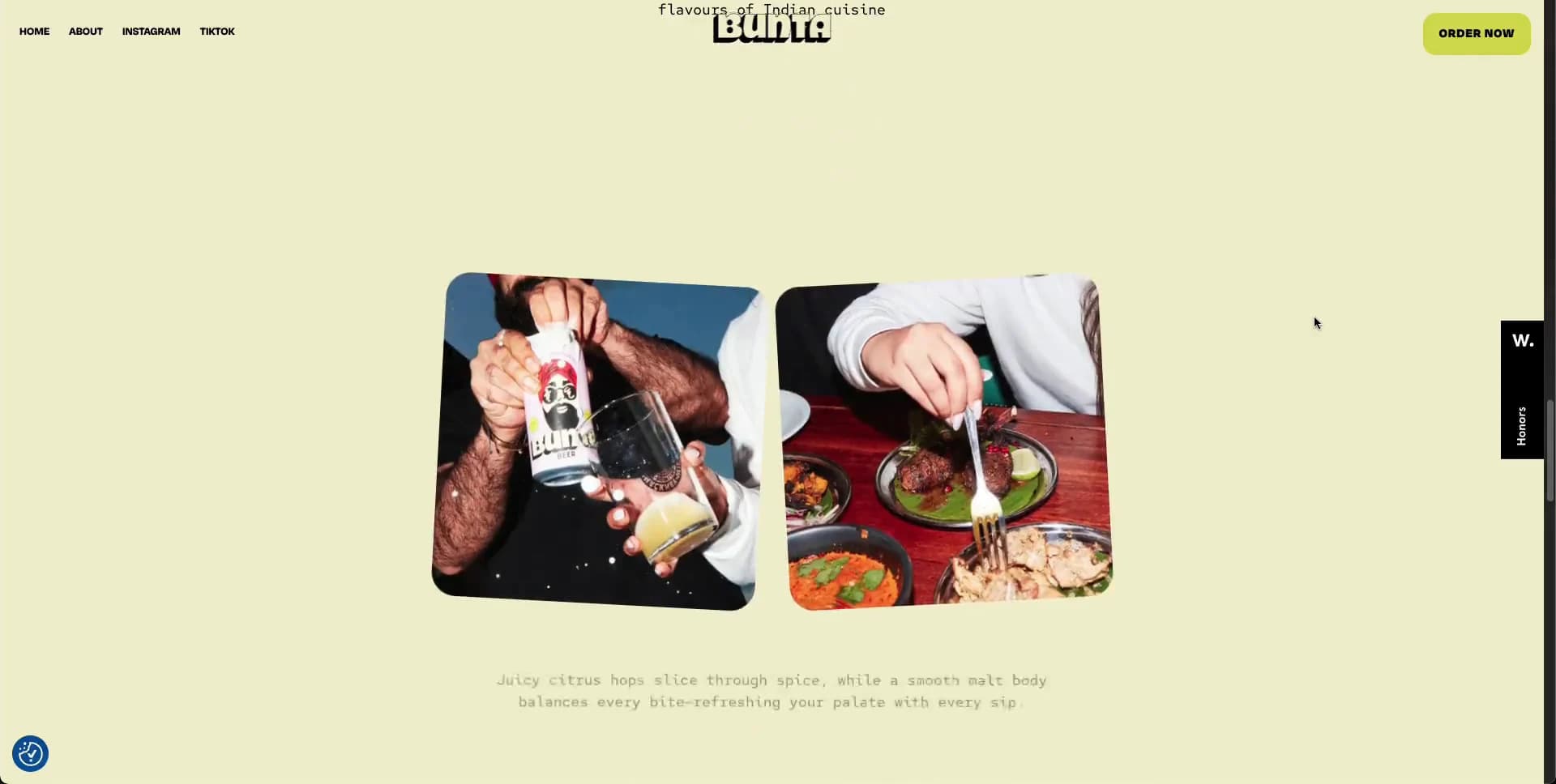
Next, bring the can upright and centered. Put two balanced all-caps claims on either side at about 18–25vw from centre, and add two small irregular acid-yellow burst labels near the can: one near the upper right, one near lower left. Let the can rotate enough to show its side and front artwork as it settles. Continue with two rounded-square food photos in a compact pair, approximately 210–300px each on desktop, set low in an otherwise spacious cream panel. Build a sustainability/editorial beat with a centred icon or line motif, a short heavy headline, restrained mono copy and four asymmetrically distributed tilted statistic cards that drift partly beyond the viewport: powder pink at lower left, raspberry lower right, black upper left and acid-yellow upper right. Keep all copy original.

Create a horizontal strip of oversized, colourful food-name stickers across the viewport, each with irregular spacing, alternating pink, yellow-green, black and raspberry backgrounds. Beneath it, make a centred newsletter call-to-action with a large two-line display heading, small mono helper copy, a white rounded email field and a compact yellow-green submit button. End with a custom illustrated mascot/packaging mark or simple own-logo lockup above a small footer nav. Never reuse brand names, labels, taglines, logos, food photography or text from the reference; commission, shoot, or generate equivalent original material.

Use DOM sections, responsive images, CSS transforms and intersection-driven class changes; a canvas/WebGL scene is unnecessary. Preserve the wide 1.98:1 reference composition for desktop media artwork and any supplied scene backgrounds. Use semantic header, nav, main, section, form and footer elements. Give the email field an explicit visible label or accessible name, strong focus ring, real form error feedback and sufficient contrast. Load the first photo and product visual eagerly only when needed for the opening; lazy-load lower media, reserve image dimensions to prevent layout shift, and provide static settled positions if scripting fails. Respect reduced motion by retaining the ordered story and final content while removing large travel, rotation and parallax.
Create a free account to unlock all prompts
These prompts describe a visual language: composition, rhythm, type scale and motion. Build with your own branding, copy, logos and imagery — the design and content of Bunta Beer belong to their authors.
Build Recipe
Framework
- Webflow· Detected
Creative tools
- Nano Banana
Special requirements
AI Replicability
88 / 100
Main remaining challenge
The design and branding of Bunta Beer belong to their authors. InspoToCode documents its visual language as a reference; anything you build from it should carry your own branding, copy and assets.
Design analysis
- Photography panels use roughly 24–32px rounded corners; buttons and sticker blocks are softly rounded rather than pill-perfect.
- Tiny uppercase black labels sit in acid-yellow rounded rectangles; the primary action stays fixed at the upper right.
- Fact cards are flat, saturated rectangles with roughly 18–28px corners, strong black type and deliberate rotation.
- Almost no conventional UI shadowing; dimensionality comes from real can photography and contrast.
- No visible card border system. The floating right-edge agency tab is a stark black vertical slab with white type.
- Very generous blank cream space isolates each product-story beat; compact navigation contrasts with huge type and large visual gaps.
- The desktop story uses the full 1920×968 stage, with centred modules usually occupying roughly 40–80% of the width.
- A persistent, very small uppercase text navigation spans the upper left, with a centered logo treatment and a right-side action.
- Flash-lit, close-cropped food photography has intense warm reds and greens. The pink can is shown as a clean isolated product render or photographed among dishes.
- The visible system is overwhelmingly flat colour; do not introduce atmospheric gradients.
- A single-column scroll narrative alternates media, central statements, product isolation, side-by-side claims, scattered data cards, horizontal food tags and a centred signup.



