Cowboy E-Bike Home
us.cowboy.com
Hardware
- Animation
- Dark
- Editorial
- Large type
- Light
Palette
Typography
Primary
SuisseIntlMono
Unknown
About this design
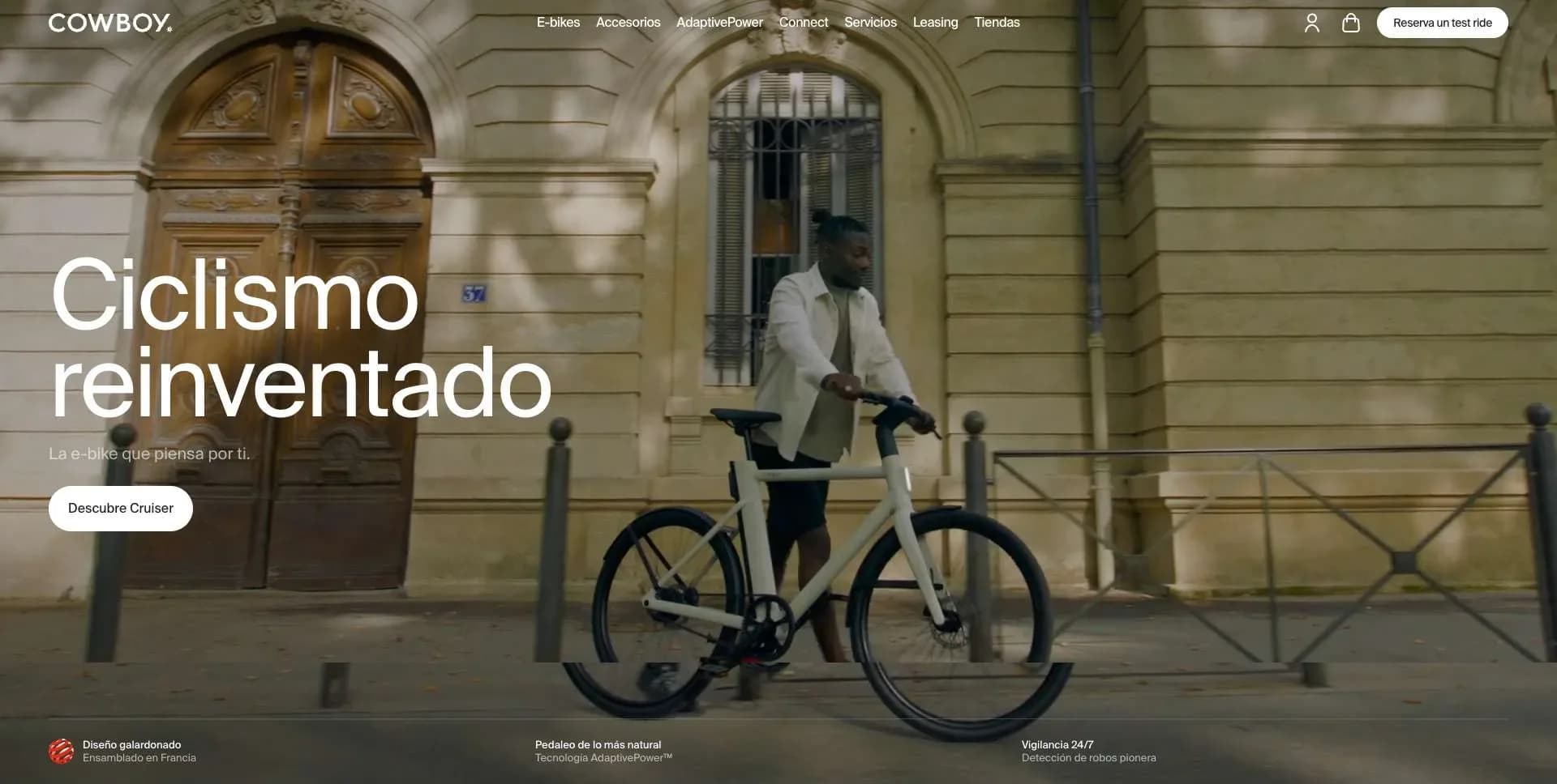
A premium connected e-bike storefront that combines cinematic urban footage, exceptionally large product cut-outs, editorial feature panels, community photography and a dark manufacturing-story sequence.
Prompts
Main build prompt
Use the following dimensions and timings as reconstruction targets inferred from the reference, not exact measurements of the original implementation. Build a long-form premium connected-mobility hardware homepage whose signature is the alternation between full-bleed cinematic film, huge isolated vehicle render stages, and stark editorial chapters. Design for the observed 1920×968 presentation frame (≈1.98:1); preserve that wide ratio for hero and full-width video posters.

Start with a pale #f5f5f5 document and nearly black #030303 type in SuisseIntl or a close neo-grotesk substitute. Place a transparent ~54–64px header over the first film frame: own wordmark at left, compact category links centered, two small utility icons and a white rounded CTA at right. Overlay a thin translucent rule beneath it. The hero should be around one presentation-frame tall: a muted, warm urban cycling video, dimmed about 25–40% for contrast, with a large white two-line own headline at lower left (~72–92px desktop, ~0.96 line height), a short supporting line, a white pill CTA, and three tiny proof statements spaced along the bottom edge.

Follow with two product chapters on nearly white/very pale gray. Each begins with a short left-aligned product label, tiny plus-prefixed specifications, and a two-option segmented variant switch aligned right. Make the bicycle render dramatically oversized—around 110–145% of its containing width—and crop wheels or handlebar at the stage edges. Give each stage roughly 0.9–1.15 viewport of height, a barely visible gray gradient near the lower ground plane, and small previous/next arrow buttons low left. Alternate a pale bike and a dark bike rather than adding conventional product cards.

Insert an approximately 120–170px dark separator/banner and a compact horizontal recognition strip of five equal white tiles. Then create a centered headline on pale ground, about 52–68px, with its last phrase reduced to #dcdcdc. Stack three offset landscape video/image rectangles beneath it like stepped layers; transition into a full-bleed, darkened street-film panel with centered white technology heading, three circular icon explanations, brief copy, and a white CTA.

Create a charcoal #1c1c1c technology chapter as a two-column mosaic with ~8–12px gutters. In the left white panel, use one sharp dark feature heading followed by a long deliberately faded list. Pair it with a tight technical bicycle-detail image on the right. Continue with a second image/text pair, then a short white text band; all content stays rectilinear and calm. Next, return to pale ground for a centered community heading and a broad seven-to-nine-column masonry of varied vertical rider photographs, each with ~5–8px rounding and irregular heights. Use original/generated lifestyle photos; never use copied campaign imagery.

Below, include a small mechanical flip-counter and a wide map/test-drive module: dark text block at left, pale map at right with soft green translucent location circles. Add a pale quiz CTA slab. The second major signature sequence is a run of four nearly viewport-height workshop, service, product-closeup, and rider films. Each has white lower-left headline/copy, a dark lower gradient, a thin bottom progress rail with four labels, and a small stacked preview card at upper right. Use video with poster fallback.

Finish with a pale editorial-news row of three landscape cards, then a dark exploration band: large centered white heading over black, four wide white navigation tiles, and a large outdoor lifestyle image extending below. Close with a dense charcoal footer of link columns, newsletter field, social icons, own wordmark, legal line, and subtle rules.

Use semantic header/nav/main/section/article/footer, captions or transcripts for meaningful video, descriptive alt text, real buttons for carousels/toggles, visible focus rings, sufficient overlay contrast, and reduced-motion posters. Use DOM, CSS Grid/Flexbox, responsive images, and native video; canvas/WebGL is unnecessary. Avoid glossy gradients, floating shadows, neon UI, generic feature-icon grids, testimonial sliders, excessive rounded cards, or decorative animation unrelated to the photographic story.
Create a free account to unlock all prompts
These prompts describe a visual language: composition, rhythm, type scale and motion. Build with your own branding, copy, logos and imagery — the design and content of Cowboy E-Bike Home belong to their authors.
Build Recipe
Framework
- Shopify· Detected
- Shopify
Creative tools
- Nano Banana
- Krea
- Runway
Special requirements
AI Replicability
87 / 100
Main remaining challenge
The design and branding of Cowboy E-Bike Home belong to their authors. InspoToCode documents its visual language as a reference; anything you build from it should carry your own branding, copy and assets.
Design analysis
- Mostly square media and panels; use roughly 4–8px rounding on small cards, pills, and image tiles only.
- Compact white or near-black pill CTAs with dark/white text; utility controls are minimal outline icons and small rounded rectangular toggles.
- Editorial image cards have small radii and almost no chrome. The dark feature grid uses black gutters as the structure rather than floating-card shadows.
- No expressive drop shadows; rely on photographic contrast, black gutters, and subtle borders.
- Hairline #dcdcdc rules on light sections; translucent white rules overlay dark photographic sequences.
- Very generous vertical chapter spacing; compact 16–32px inner padding for UI, approximately 32–64px page gutters, and large 96–180px editorial breathing room.
- Hero media is edge-to-edge. Standard text and product sections use broad desktop gutters; centered editorial modules occupy roughly 80–90% of page width.
- A thin transparent overlay bar on hero footage, with a wordmark left, compact centered links, utility icons, and a bright pill CTA right.
- High-end lifestyle video, workshop footage, giant isolated bike renders, close technical details, a varied rider-photo masonry, and a pale map graphic.
- Subtle black-to-transparent lower overlays protect white text on video; otherwise backgrounds are flat and restrained.
- A long linear hardware narrative: hero film, oversized product stages, credibility strip, technology story, split feature mosaic, community collage, location/test module, manufacturing film chapters, editorial cards, and dark footer.



