Craft
craft.do
Productivity
- Editorial
- Light
- Minimal
Palette
Typography
Primary
UntitledSerifFontSecondary
UntitledSansFont
About this design
A product-marketing page for a notes and productivity app, built as a long editorial scroll of pastel product tableaux, people-led use cases, testimonials and a stark black footer.
Prompts
Main build prompt
Use the following dimensions and timings as reconstruction targets inferred from the reference, not exact measurements of the original implementation. Build a Spanish-language-agnostic productivity-product landing page whose signature is a warm off-white editorial scroll punctuated by big pastel app tableaux, analogue paper-collage scenery and a small floating navigation capsule. Use your own wordmark and entirely original headline, labels, testimonials, portraits and interface content.

Frame the desktop experience in the observed wide 1920×968 composition. Set the page ground to #f5f4f2, ink to #0b0b0b, and make the central top navigation a roughly 490px-wide white, semi-opaque pill positioned about 10px from the viewport top. It contains a compact black custom wordmark at left, 6–7 tiny sans links, and a black pill CTA at right. It stays visually above the page while scrolling, with a low diffuse gray shadow and no heavy glassmorphism. Keep all page panels about 8–12px from the viewport edges.

Open with a nearly full-viewport, rounded powder-blue (#acdbec) stage. First reveal only its quiet cloudy-paper background and floating navigation, then introduce a centered serif headline around 44–56px with ~1.02 line height. Build a handmade background from original low-contrast paper scraps: cloud-like white cutouts, a blue painted shape, a yellow ruled-paper shape and a black torn strip. Layer a fictional desktop productivity-app screenshot across the lower third, partially clipped by the stage. Its white application frame contains a narrow sidebar and colourful rectangular content cards. A pale pill button sits beneath the headline. Use DOM/CSS and SVG texture layers rather than canvas or WebGL.

Continue the vertical narrative with a centered two-line serif statement around 30–36px, then a horizontally arranged use-case gallery. Each item is a roughly 128×160px tall portrait with 14–18px rounding, an original 1:1-ish head-and-shoulders portrait against an abstract bold graphic backdrop, a small uppercase role caption, and a short italic serif descriptor. Permit the outer items to clip beyond the viewport to make the row feel expansive. Follow it with spacious quote interludes: a tiny circular avatar, a small name, a thin horizontal rule and an italic serif quotation offset into the middle of the page.

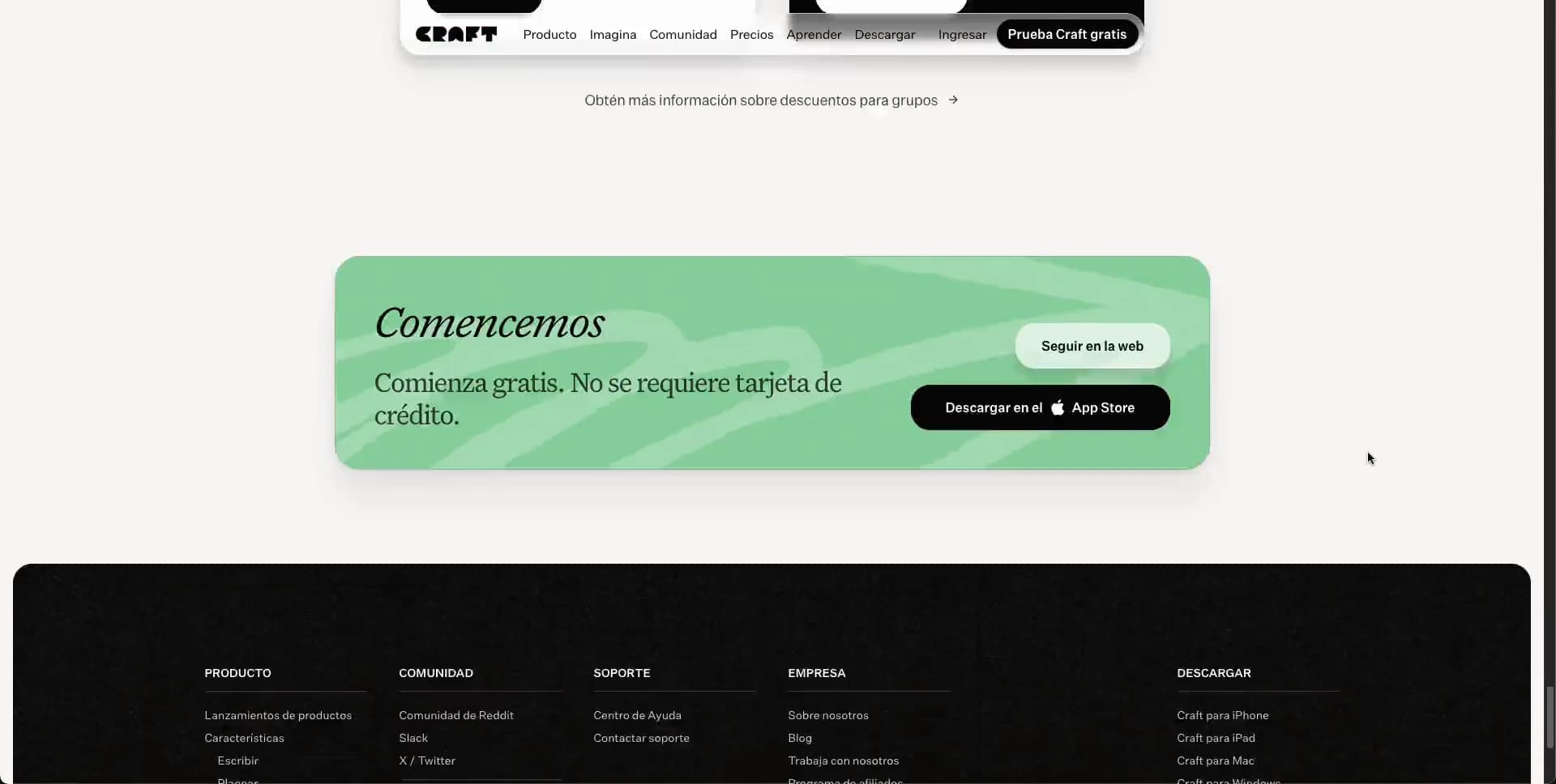
The core product portions are individual centered scenes rather than repeated marketing cards. Make one green (#82cb96) rounded tableau with a left text column and white integration tiles; make a butter-yellow (#f9de8d) planning tableau with a left editorial copy column and a 2×2 collection of white task, calendar, diary and reminder UI panels. Give these panels subtle gray borders, about 10–14px radii and gentle shadows. Later add a centered community heading, a misty pale-blue cloud/collage accent behind it, and four large social/community tiles in red, white, black and white. End with a compact green CTA stage, then a wide near-black rounded footer. The footer has five compact navigation columns, fine charcoal rules, tiny gray links, language/social controls and considerable negative space.

Use the detected Untitled Serif-style family for all expressive headlines, italic quotations and product-scene headings. Use the detected Untitled Sans-style family for navigation, controls, captions and UI. Serif text is elegant, high-contrast and unforced; sans labels are compact and dense. Do not add enormous geometric sans headlines, gradient text, icon-heavy feature grids, testimonial carousels, excessive floating cards, thick borders or conspicuous drop shadows. The result should feel like an editorial art book that happens to demonstrate software, not a default SaaS template.

On entry, stage the hero as a composed reveal: background first, then headline/button, then collage pieces and the lower product screenshot. During normal vertical scroll, preserve the persistent navigation and let each section arrive with restrained opacity/translate reveals. Support keyboard navigation, visible focus rings that respect the black/cream palette, semantic landmarks, meaningful alt text for portraits, and reduced-motion alternatives. Use responsive images, lazy-load below-the-fold portraits and mockup imagery, reserve every image dimension, and keep textured decoration nonessential so it can be omitted on low-power devices.
Create a free account to unlock all prompts
These prompts describe a visual language: composition, rhythm, type scale and motion. Build with your own branding, copy, logos and imagery — the design and content of Craft belong to their authors.
Build Recipe
Framework
- React
Creative tools
- Nano Banana
- Recraft
Special requirements
AI Replicability
89 / 100
Main remaining challenge
The design and branding of Craft belong to their authors. InspoToCode documents its visual language as a reference; anything you build from it should carry your own branding, copy and assets.
Design analysis
- Large feature tableaux use roughly 18–24px corner radii; the navigation and CTA are fully pill-shaped. Small internal cards are softly rounded, around 10–16px.
- Compact black filled pill CTA with white sans text; secondary hero CTA is a pale translucent/white pill with a restrained soft shadow.
- Avoid a generic card grid. Product screens contain layered white UI cards with thin gray edges, while use-case portraits are tall rounded rectangles.
- Very restrained diffuse shadows under the floating nav and large coloured tableaux; internal mockup cards have faint elevation only.
- Hairline neutral-gray UI borders and occasional low-contrast rules. The black footer uses faint charcoal separators.
- Broad editorial whitespace separates each story beat; content blocks are generally centered with generous vertical gaps, while dense mockup modules use tight internal gutters.
- Near full-width canvas with about 8–12px outer margins for major panels. Reading content and coloured scenes narrow to a centered medium-width column.
- A small white floating capsule remains near the top center, with logo, compact horizontal links and a black terminal CTA; it shadows subtly above every section.
- Paper-cut, hand-assembled collage textures sit behind polished app screenshots. Portraits are tightly cropped, each paired with a distinct abstract coloured backdrop.
- Mostly flat powder pastels with subtle cloudy texture or broad tonal variation, never glossy gradients.
- A single long vertical narrative: full-width hero tableau, centered serif transition, horizontal people strip, isolated testimonial quotes, centered product scenes, community cards, final green CTA and oversized footer.



