Customer.io
customer.io
SaaS
- Large type
- Light
- Minimal
Palette
Typography
Primary
saansFont
About this design
A polished B2B customer-engagement homepage that moves from a spare white product hero through modular feature grids, a dark enterprise proof section, editorial case studies, and a dense operational footer.
Prompts
Main build prompt
Build an original B2B customer-engagement marketing homepage led by the signature: a quiet near-white editorial page that repeatedly switches between expansive type, hairline-rule grids, interface evidence, and one deep blue-green enterprise section. Use the following dimensions and timings as reconstruction targets inferred from the reference, not exact measurements of the original implementation. Compose against the supplied 1920×968 (approximately 1.98:1) desktop reference stage; retain this ratio for any full-width background or poster material.

Use #fcfcfc as the principal ground, #021718 as the primary ink and dark-section ground, #292929 for secondary ink, #dcdbdc for dividers, and #b6bcbb for muted detail. Set the detected saansFont as the main family, with a clean grotesk fallback. The desktop header is about 34px tall, white, separated by a nearly invisible bottom rule, and stays visually present at the viewport top. Place an original small symbol-plus-wordmark at left, a centered cluster of four or five compact navigation links, and utility/actions on the right. Use one dark filled pill action and one white outlined pill action; target ~32–40px height. Do not use a giant floating nav, gradients, glass effects, or large shadows.

Start with a tall white hero. In a centered ~1280–1340px frame, position a two-line left-aligned headline at roughly 54–66px desktop size, ~1.0 line height, medium weight, and a narrower supporting paragraph below. Add two compact pill CTAs and a tiny three-item reassurance row with miniature line icons. Keep much of the hero’s right side intentionally empty. Below it, frame a broad original product-dashboard mockup over a warm, softly lit workplace photograph; the screenshot should span roughly two-thirds of the container and appear as a flat composited UI layer, not a glossy browser window. Follow with a ruled two-row customer-proof strip using invented monochrome logos, then a centered proposition at roughly 34–42px with selected words individually coloured muted violet, coral, blue, ochre, and green.

Continue with a left-aligned section heading and a shallow, full-width five-column capability image strip. Use distinct but tonally related photography in each column, cover it with a deep teal overlay, and reveal one clearer rightmost tile; label each tile along its bottom edge. Add a small original AI-related feature panel below, then a solutions section with a small mustard rectangular eyebrow and a two-by-two, thin-ruled grid. Each grid cell has an airy outlined SVG illustration near the top (calendar/check, envelope, headset, compass-like mark), an 18–22px title, and two short lines of supporting text. Avoid rounded feature cards, icon circles, colored cards, testimonial carousels, and overbuilt decorative blobs.

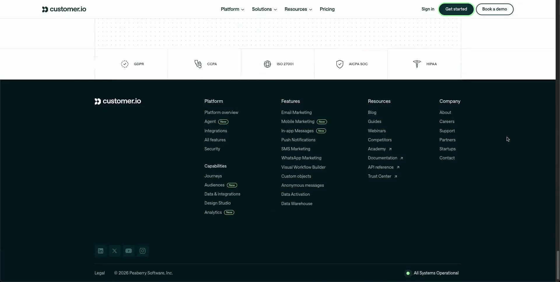
Create a strong tonal pivot into a deep #021718 enterprise section. Center a white heading, then place a large ~2-column modular panel beneath it. Its upper left describes integrations; its upper right is a sparse grid of generic integration-logo tiles. Its lower left holds a small geometric illustration: blue and cream polygon, a thin looping blue line, an outlined grid and bright blue oval. Its lower right vertically stacks security and support copy separated by faint rules. Maintain barely visible dark borders and soft white/mint micro-labels. After returning to white, present two wide case-study panels in pale peach and pale blue: concise metrics in the upper edge, original testimonial copy, and a cutout portrait photo cropped inside a bold geometric red/orange or blue field. Finish with a thin compliance-badge strip and a dense dark footer arranged in approximately four link columns, operational status dot, legal details, and social icon buttons.

Use semantic header, nav, main, section, article, figure, footer, real headings, descriptive alt text, visible keyboard focus, and minimum ~44px touch targets where practical. Build the UI with DOM/CSS, inline SVG illustrations, and optimized static images; no canvas or WebGL is necessary. Respect reduced motion with immediate but graceful content visibility and no parallax. Load only the hero/dashboard and first visible images eagerly, use responsive image sizes and reserved aspect-ratio boxes to avoid layout shift.
Create a free account to unlock all prompts
These prompts describe a visual language: composition, rhythm, type scale and motion. Build with your own branding, copy, logos and imagery — the design and content of Customer.io belong to their authors.
Build Recipe
Framework
- React
Creative tools
- Nano Banana
- Recraft
Special requirements
AI Replicability
90 / 100
Main remaining challenge
The design and branding of Customer.io belong to their authors. InspoToCode documents its visual language as a reference; anything you build from it should carry your own branding, copy and assets.
Design analysis
- Controls are pill-shaped with roughly 999px radii; content panels are predominantly square-cornered or very subtly rounded.
- Compact ~32–40px-high pills: dark filled primary action, white secondary action with a dark 1px outline, and restrained horizontal padding.
- Feature and solution content sits in thin, pale-rule grid cells rather than floating rounded cards; case studies use broad pastel rectangular panels.
- No prominent drop shadows; depth comes from framing, tonal blocks, image crop, and hairline dividers.
- Fine low-contrast gray dividers organize logo strips, 2×2 tiles, footer columns, and content panels.
- Generous vertical section breathing room, then compact internal card padding; headings are deliberately offset to the left of a centered content frame.
- Desktop content is roughly a 1280–1340px centered frame within the 1920px capture; hero copy begins around the left quarter of the viewport.
- A thin fixed-looking white header uses left wordmark, centered text links with chevrons, and right-aligned sign-in plus two pill actions.
- Mix interface screenshots with warm workplace photography, small outline illustrations with mint accents, muted integration marks, and cropped portrait-led editorial case studies.
- No defining gradients; use flat near-white, deep teal, pale peach, pale blue, orange-red, blue, and mint image/panel accents.
- Long editorial scroll: hero/product proof, centered statement, feature strip, solutions grid, dark enterprise grid, case studies, compliance strip, and a structured dark footer.



