Filip Felbar — Senior Digital Designer
filipfelbar.com
Portfolio
- Animation
- Editorial
- Large type
- Light
- Minimal
Palette
Typography
Primary
LausanneSecondary
Ghost
About this design
A personal digital-design portfolio that turns a simple directory-style introduction into a dramatic typographic stage, then punctures its editorial calm with a large, constantly changing project-media panel.
Prompts
Main build prompt
Build an original personal-portfolio homepage around this signature: an almost-white editorial field, an oversized two-line declaration combining a heavy neo-grotesk sans with a high-contrast italic serif, followed by a long editorial selected-work index with large project media, sparse metadata, and restrained motion.

Use the following dimensions and proportions as reconstruction targets inferred from the reference, not exact measurements of the original implementation. Frame the desktop composition at 1920×968, with a near-full-width shell and approximately 26–28px side gutters. Use a warm ivory page ground around #F8F7EF and near-black typography around #171717. Do not add color accents outside project imagery, gradients, shadowed cards, pills, conventional CTA buttons, feature grids, testimonials, decorative textures, or generic SaaS sections.

At the top, create a four-column information directory with a roughly 26px top margin. Column one contains a small underlined personal wordmark and a short two-line role description. Column two lists capabilities or disciplines beneath a quiet grey lowercase label. Column three lists selected projects as underlined text links. Column four contains direct contact links. Use the sans face throughout this utility area at approximately 18–28px, ~1.05 line height, semibold weight. Labels should be around 16px, muted grey, lowercase, and slightly open in tracking. Keep the columns distributed calmly across the page rather than enclosed in a navbar.

Leave a major vertical pause after the directory, then create the main statement beginning around 390–410px from the viewport top. It should stretch almost edge to edge across two tightly stacked lines. Set the bold sans words around clamp(64px, 7.7vw, 148px), heavy weight, approximately 0.88–0.95 line height, with slightly negative tracking. On part of the second line, splice in an expressive high-contrast italic serif at a matching visual height, around clamp(72px, 8vw, 156px). The italic is not a subtitle: it shares the same visual statement and should feel theatrical against the blunt geometry of the sans. Use original copy, never the reference wording. Tune individual word spacing and serif overhangs optically instead of forcing mechanically equal spacing.

Immediately below the statement, introduce the project presentation area. Begin with a wide near-black media field that can be used as a transitional stage for changing project imagery or a short montage. Its resting surface is approximately #0B0B0B. Allow original project imagery to enter as oversized crops, split panels, diagonal reveals, or short moving sequences. Use stills or muted video. Keep this stage visually simple and subordinate to the portfolio content that follows.

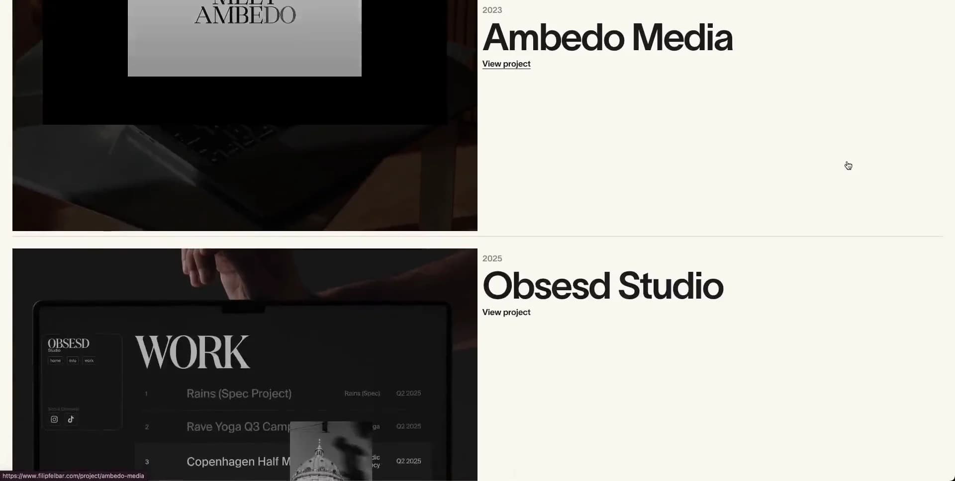
After this opening transition, build the core of the page as a long editorial “selected work” index rather than a grid of cards. Each project should occupy a wide horizontal row separated by fine hairline rules or generous whitespace. Use a large media preview on the left, taking roughly 60–75% of the row width, and a sparse metadata column on the right. The metadata should contain the project year in small muted text, a large project name, and a restrained underlined project link such as “View project”. Avoid boxed cards, badges, chips, shadows, rounded SaaS containers, or dense descriptions.

Let each project row feel intentionally oversized and quiet. Alternate still images, short motion clips, interface fragments, editorial photography, architectural compositions, or monochrome portraits depending on the project. Preserve generous vertical whitespace between entries. Some rows may crop imagery tightly while others can sit more calmly within the page, but maintain a consistent relationship between media, project title, year, and link.

Use a strong editorial rhythm:
1. compact directory;
2. large empty pause;
3. oversized typographic identity statement;
4. short visual transition stage;
5. long selected-work list;
6. minimal closing contact/footer area.

For reconstruction, use semantic DOM layout for all text, navigation, project metadata, and links. Use CSS Grid for the top directory and each project row. Use native image and video elements for media. Use GSAP only where coordinated project-media transitions require more than CSS can provide. Do not use canvas, WebGL, parallax, 3D, or decorative effects.

Respect reduced motion by displaying stable project stills and simple opacity changes. Keep every project link keyboard reachable, preserve strong native focus visibility with a 2px offset outline, provide descriptive alt text, captions or transcripts where video communicates meaningful information, and add pause controls if looping media persists.

Preload only the typography and first visible poster needed above the fold. Lazy-load project media further down the page, reserve aspect ratios to avoid layout shift, and serve responsive image/video sources. The visual identity should come from typography, spacing, scale, hard edges, and art-directed project imagery—not from UI effects.
Create a free account to unlock all prompts
These prompts describe a visual language: composition, rhythm, type scale and motion. Build with your own branding, copy, logos and imagery — the design and content of Filip Felbar — Senior Digital Designer belong to their authors.
Build Recipe
Framework
- Webflow· Detected
- Webflow
Creative tools
- Nano Banana
Libraries
- GSAP· Detected
- Lenis· Detected
- Barba.js· Detected
- GSAP
Special requirements
AI Replicability
86 / 100
Main remaining challenge
The design and branding of Filip Felbar — Senior Digital Designer belong to their authors. InspoToCode documents its visual language as a reference; anything you build from it should carry your own branding, copy and assets.
Design analysis
- No visible rounding in the page shell. Keep media rectangular and use a hard-edged editorial geometry.
- Links are plain underlined text rather than pill buttons; retain a text-first interaction language.
- Avoid conventional cards. Work is presented as a single oversized edge-to-edge media stage.
- No decorative shadows; contrast comes from black media against the warm ivory page.
- Underline navigation links with approximately 1–2px near-black rules. No panel outlines beyond image edges.
- Generous vertical vacancy separates the compact directory from the oversized headline; tight line spacing makes the headline feel like one object.
- Desktop content sits in a nearly full-width shell with roughly 26–28px outer gutters.
- A four-column directory acts as the navigation: identity, capabilities, selected work, and contact links.
- Large cropped project footage and stills appear inside a black stage; imagery is high contrast, editorial, and allowed to crop aggressively.
- No visible gradients. Preserve the flat warm ground and deep black media surface.
- Four compact columns occupy the top; a huge two-line statement spans almost the entire width below; a wide media panel begins immediately under it.



