folk — CRM landing page
folk.app
SaaS
- Editorial
- Large type
- Light
- Minimal
Palette
Typography
Primary
FoundersgroteskSecondary
InstrumentserifMono
Inter
About this design
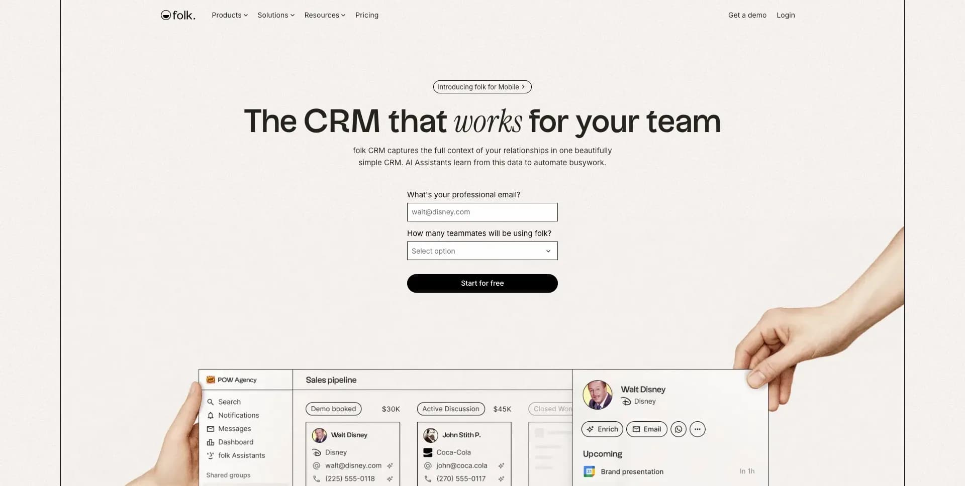
A CRM product page that trades glossy SaaS conventions for editorial scale, sparse black rules, tactile hands, and deliberately diagrammatic product demonstrations.
Prompts
Main build prompt
Use the following dimensions and timings as reconstruction targets inferred from the reference, not exact measurements of the original implementation.

Build a long-form CRM marketing page whose signature is a warm, lightly speckled paper canvas with enormous, thinly outlined CRM panels apparently held by two cropped human arms. The effect should feel like a considered print campaign made interactive, not a typical gradient-heavy SaaS landing page. Target the supplied presentation frame at 1920×968 (~1.98:1). Use semantic DOM, CSS Grid, inline SVG for tiny product icons, and CSS transforms for motion; a canvas or WebGL scene is unnecessary.

Set the page ground to near-white #fefefe with a nearly imperceptible warm grain overlay. Use near-black #010000 for copy and all rules. Center desktop content in a roughly 1280px max-width column. Make the header about 52–60px tall, narrow and quiet: custom wordmark at left, four compact navigation items after it, and two utility links on the far right. Keep body text around 13–16px and headings in a characterful neo-grotesk display face. Make main display lines roughly 58–72px with tight ~0.95–1.02 leading. Introduce one italic serif word within the hero headline as a contrast rather than turning every heading into a serif treatment.

Hero: occupy roughly 760–800px under the header. Center a small outlined announcement pill, a two-line display headline, a short centered paragraph, then a compact lead form ~300px wide: stacked labels, thin outlined input/select fields, and a full-width black pill action. Begin the oversized CRM board low in the hero, centered and cut off by the lower boundary. It should have a thin black outline, a narrow sidebar, pipeline columns, cards, and a contact detail sheet overlapping its right side. Use substitute data and invented names. Place a generated/commissioned left forearm entering from the lower-left edge and a right forearm entering from the upper-right edge, both with transparent alpha, warm natural skin, soft diffuse lighting, and crops that make them visibly grip the board. Do not use original photography, real people, logos, product copy, or brand marks.

Immediately follow with a centered trust line, then a ~6-column by 3-row outlined logo grid populated with invented monochrome wordmarks or neutral abstract client marks. Beneath it place three compact ratings separated by generous white space. Start the product story with a large left-aligned heading and a broad, delicate systems diagram: small integration boxes on the left feed via fine curved SVG connector lines into a central circular assistant mark, which branches to stacked outcome cards at right. Make this airy and technical rather than decorative.

Build five repeated feature modules, each with a large 34–44px black heading, a one-line muted description, a small right-aligned text link with arrow, and a large black-outlined demonstration panel below. Vary the demo ground using pale powder blue #bddeec, soft buttery yellow #fceebc, whisper green, faint lavender, and paper white. Populate them with highly legible pseudo-application UI: an extension drawer over a browser-like frame; a data table with selected rows and blurred placeholder entries; a sequence editor with email sheets and delay pills; a contact timeline; and a deal board paired with an analytics card. Use 1px rules, square corners, restrained 10–14px UI type, occasional badges, and faint paper texture. Product cards may overlap inside a demo, but must not use drop shadows, glass effects, neon, oversized rounded rectangles, or generic dashboard chrome.

After these modules, create a four-column capability strip of equal outlined tiles, then a testimonial section with a large heading and a 3×2 grid. Each testimonial is a bordered cell with compact quotation text, one or two subtly highlighted phrases, and a small monochrome circular placeholder portrait with invented attribution. One cell can use a muted grayscale generated interview still and a central black circular play control; it should be a substitute clip/poster, not copied media. Follow with a compact trust-and-compliance row using three outlined icon cells.

End with a bordered conversion panel on lightly textured paper ground, around 1200px wide and 250–300px high: large two-line heading left, the same compact form right. Then a full-width 1px top rule and a sparse multi-column footer with compact category labels, link stacks, legal links, language control, and small social icons. Maintain very large vertical rests, roughly 110–180px between primary sections.

On hover, text links can shift their arrow ~4px and outlined interactive product elements can gain a very faint off-white fill. Inputs need visible black focus rings, real labels, error containers, keyboard navigation, and sufficient contrast. Respect reduced motion by preserving section reveal hierarchy with instant opacity states and no transform travel. Do not add a sticky promotional banner, bento feature grid, testimonial carousel, glossy shadows, gradient blobs, floating chat widgets, or a generic rounded-card SaaS aesthetic.
Create a free account to unlock all prompts
These prompts describe a visual language: composition, rhythm, type scale and motion. Build with your own branding, copy, logos and imagery — the design and content of folk — CRM landing page belong to their authors.
Build Recipe
Framework
- Webflow· Detected
- Webflow
Creative tools
- Nano Banana
- Recraft
Special requirements
AI Replicability
89 / 100
Main remaining challenge
The design and branding of folk — CRM landing page belong to their authors. InspoToCode documents its visual language as a reference; anything you build from it should carry your own branding, copy and assets.
Design analysis
- Mostly square corners and sharp ~0–3px radii. Pills appear only for status labels, compact actions, and the primary CTA.
- Dense near-black pill CTA with white text; secondary controls are white, thinly outlined, and compact. Product controls mimic utilitarian desktop UI.
- Product panels and testimonials are rectangular white cells with fine black outlines; no floating SaaS-card treatment.
- Virtually none. Hierarchy comes from outlines, pale tinted grounds, overlap, and occasional faint soft texture rather than elevation.
- Fine near-black 1px rules organize nearly every interface, logo grid, testimonial cell, panel, and footer boundary.
- Large editorial whitespace between sections, with compact internal UI spacing. Each product section uses a clear heading-to-demo rhythm.
- A centered content column around ~1280px wide within a wide desktop frame; hero art deliberately reaches beyond this structure.
- Small, restrained top navigation with a compact wordmark at left, grouped links, and utility actions aligned right.
- Cropped photographic forearms and hands hold interface panels in the hero. Elsewhere, interface mockups are illustration-like, faintly textured, and tightly outlined.
- No overt gradients; very subtle paper grain and pale blue, yellow, green, lilac, and off-white surface washes create material variation.
- Long single-column marketing narrative: hero, social proof, ecosystem diagram, repeated heading-plus-large-demo modules, small feature tiles, testimonial grid, trust marks, final conversion panel, and structured footer.



