HEIREST — Cinematic Jewellery Atelier
heirest.com
Creative Studio
- Animation
- Editorial
- Light
- Minimal
Palette
Typography
Primary
Moderat-RegularSecondary
ModeratMono
ModeratMono-Regular
About this design
A fine-jewellery storefront that treats commerce as an editorial sequence: cinematic close-ups, crisp product cataloguing, documentary-style proof points, and a restrained cream-and-oxblood identity.
Prompts
Main build prompt
Create an original luxury-jewellery commerce homepage whose signature is the tension between a quiet warm-paper catalogue and intimate, cinematic jewellery imagery. Use the following dimensions and timings as reconstruction targets inferred from the reference, not exact measurements of the original implementation. Compose the desktop page for a 1920×968 viewport and keep all full-bleed video and visual stages at the wide ~1.98:1 reference ratio.

Start with a 6–8px deep-oxblood announcement strip, then a roughly 48–56px white utility header. Put your own bold, widely tracked uppercase wordmark on the left; place three tiny all-caps navigation links centrally; put a compact currency control and 14–16px line icons at the right. On media-heavy sections, allow the header and strip to sit above the image; elsewhere they are white with ink text. Use #FAFBF6 as the dominant ground, #010000 for primary type, #5A001A as the structural dark accent, #52657B only for the occasional blue action, and #9AA5A5 for secondary rules or metadata.

The opening must be an edge-to-edge cinematic video, approximately 55–65vh tall below the announcement band. Use an original slow-fashion film: overhead hands reviewing archival paper and objects, then a tightly cropped portrait with a small diamond earring and tactile pale fabric. Apply a restrained dark overlay only at the lower left. Set a large but quiet white sentence-case campaign headline around 29–36px with ~1.05 line-height, a 12–14px supporting line underneath, and a small 1px outlined call-to-action at lower right. The video should crop with object-fit: cover and retain human skin tones, paper texture, and soft film grain rather than high-gloss commercial polish.

Immediately below, add a single-line scrolling assurance ribbon on white, bounded by fine or dotted rules. Repeat 4–5 short original benefits separated by small dots. Then place a centered two-line thesis in near-black at roughly 42–52px, with generous 76–110px top and bottom whitespace. Follow it with a five-column editorial product ledger. Each column is a tall portrait crop, approximately 0.56–0.66 width-to-height, with a small mono timecode-like line, an ‘author’ metadata label, and an original product configuration caption below. One item can carry a tiny in-image text link. Keep captions mechanically aligned and avoid rounded image frames.

Continue with a wide pale-blue textile-and-necklace banner, around 310–370px high, with white left-aligned copy and a small pale floating product-specification panel at right. Beneath it, make a standards section with a left column of stacked oversized topics, a compact central explanation and outlined action, and a right oxblood still-life image. Use simple hairline division and no drop shadows. Add a four-up category strip with shallow landscape crop thumbnails and plain ink labels below.

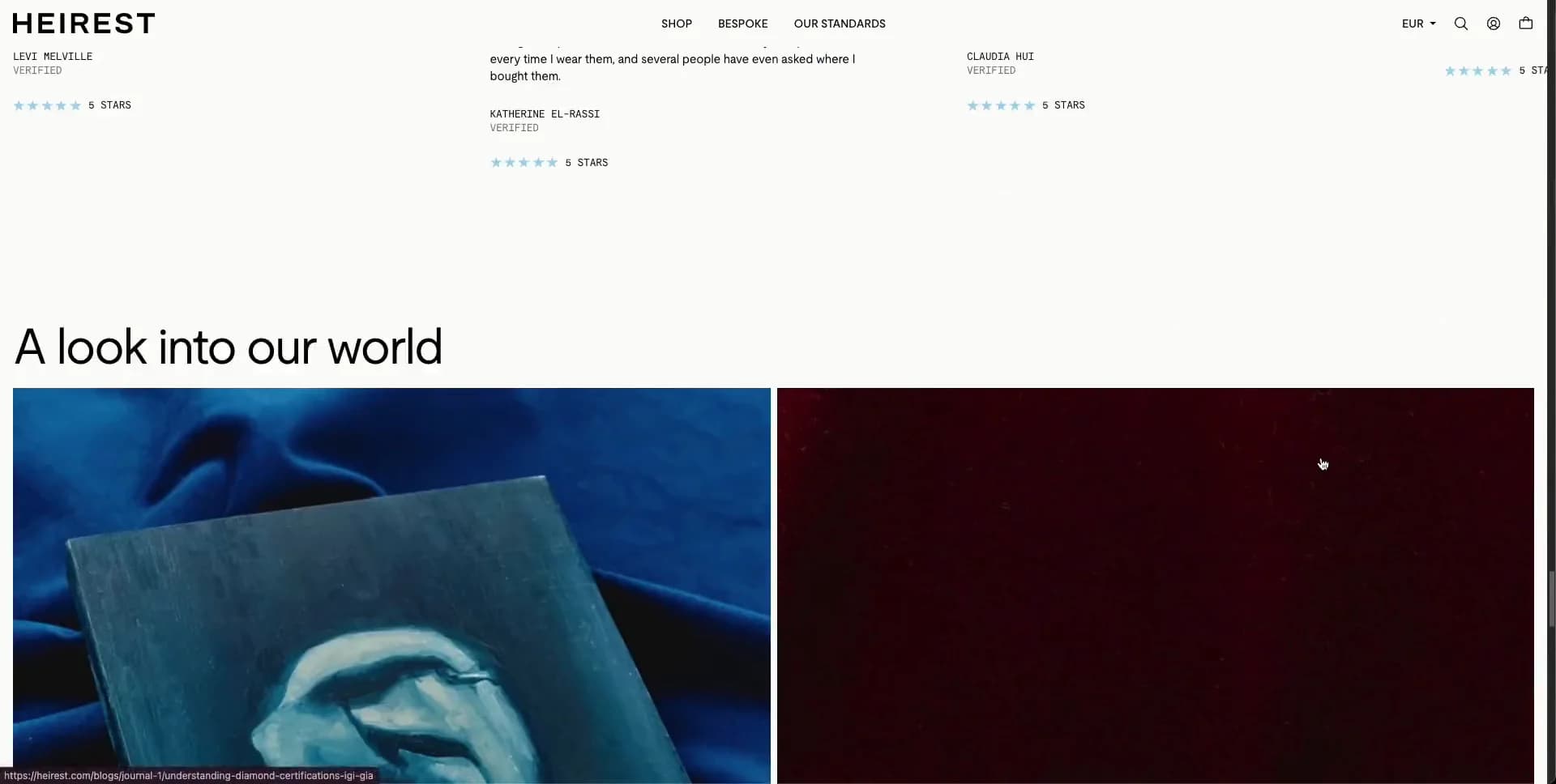
Build a press/editorial proof module on the paper ground: a left list of publication-like names in roughly 29–38px type, a small center quote and outlined action, and a portrait cover-like image on the right. Follow with a feature product triptych: two pale isolated product images on cream, then one large portrait crop. Product names sit below in regular sans with tiny mono price lines; only the featured item has a full-width pale-blue action bar. Then insert a full-width blue fabric-and-rings image, followed by a testimonial area with a ~38–48px headline, four narrow text columns, and compact square previous/next controls at upper right.

Finish with a very spacious white pre-footer containing two small offset editorial image cut-outs near the upper right, then a deep oxblood footer. Put an assurance ticker across its top, fine dotted dividers, three compact link columns, legal links along the bottom, and an abstract dotted-line jewellery motif at right. Treat all copy, branding, testimonials, and product names as original content.

Use Moderat-Regular/Moderat for the primary sans and ModeratMono-Regular for tiny labels, metadata, prices, ticker text, and utilities. Keep body text approximately 13–16px, all-caps microcopy around 8–10px with modest tracking, and large display text at normal rather than ultra-heavy weight. Use DOM, CSS Grid, responsive images, and native video for the core experience; use GSAP only as a practical recommendation for refined entrance and scroll choreography, and Swiper for horizontal content where needed. Provide video poster imagery, captions or descriptive labels for meaningful images, visible keyboard focus, labelled icon buttons, pause control for long moving media, and a reduced-motion version that uses a still hero plus gentle opacity transitions. Do not add glossy gradient backdrops, pill-shaped controls, floating frosted cards, generic feature grids, testimonial quote cards, oversized ecommerce badges, or decorative shadows.
Create a free account to unlock all prompts
These prompts describe a visual language: composition, rhythm, type scale and motion. Build with your own branding, copy, logos and imagery — the design and content of HEIREST — Cinematic Jewellery Atelier belong to their authors.
Build Recipe
Framework
- Shopify· Detected
- Shopify
Creative tools
- Runway
- Nano Banana
Libraries
- GSAP· Detected
- Swiper· Detected
- GSAP
- Swiper
Special requirements
AI Replicability
87 / 100
Main remaining challenge
The design and branding of HEIREST — Cinematic Jewellery Atelier belong to their authors. InspoToCode documents its visual language as a reference; anything you build from it should carry your own branding, copy and assets.
Design analysis
- Almost square throughout: use 0px corners for media, product tiles, cards, and fields; small outlined arrow controls may be roughly 20–24px square.
- Thin 1px outlined rectangular utility buttons with uppercase mono labels; reserve a pale-blue solid full-width purchase action for a featured product module.
- Avoid card metaphors. Products sit directly on the paper ground in strict image-and-caption columns; editorial callouts use flat, borderless panels.
- No visible decorative shadows. Use separation through white gutters, image contrast, and fine rules only.
- Hairline near-black or low-contrast grey rules define buttons, carousel controls, ticker dividers, and section boundaries; dotted horizontal rules punctuate long white sections.
- Use an airy editorial rhythm: roughly 8–16px micro-gaps, 24–32px caption spacing, 48–72px section padding, and 80–140px breathing room around large headings.
- The desktop composition is nearly full bleed with roughly 8–10px outer page gutters. Text modules align to a simple multi-column grid rather than a centered narrow container.
- A persistent slim white header places a bold left wordmark, tiny centered links, and currency/search/account/bag utilities at right; a deep oxblood announcement strip may sit above it over media.
- Use art-directed macro jewellery stills and editorial portraits: soft daylight, visible grain, lightly muted saturation, cool blue fabric and occasional deep-red fashion styling. Mix tight crops, isolated packshots, and full-bleed film.
- Do not add decorative gradients. Any tonal variation should come from photography and the dark overlay needed for hero text legibility.
- Build a scrolling editorial catalogue: full-bleed hero, narrow centered thesis, five-up image ledger, wide standards split layout, category strip, press proof, product triptych, testimonial block, and spacious footer.



