JARCOS — oversized wordmark portfolio
jarcos.work
Portfolio
- Dark
- Large type
- Animation
- Light
Palette
Typography
Primary
Inter DisplaySecondary
Inter Display
About this design
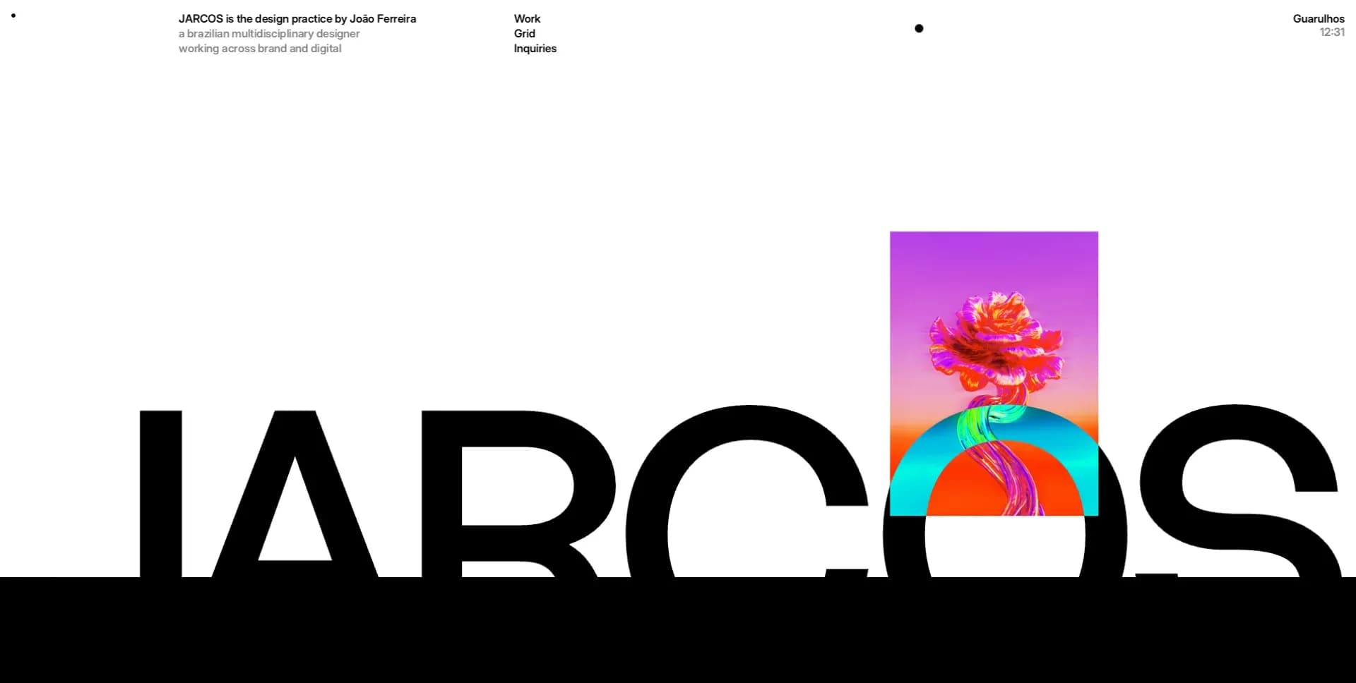
A multidisciplinary designer’s portfolio that pairs a stark editorial landing composition with a precise black project grid, letting an oversized wordmark and changing art direction carry the identity.
Prompts
Main build prompt
Use the following dimensions and proportions as reconstruction targets inferred from the reference, not exact measurements of the original implementation.

Build a personal creative-studio portfolio around one defining gesture: a near-white opening stage with an enormous black uppercase sans-serif wordmark extending beyond both viewport edges, interrupted by a narrow portrait moving-art panel that cuts through the middle of the letters.

At the 1920×968 desktop reference composition, make the opening section approximately one viewport tall. The oversized word treatment should sit across the lower half of the composition and be deliberately too large to fit comfortably inside the viewport.

Use a heavy neutral grotesk for the giant wordmark. Use Inter Display if it has been technically verified and licensing permits it; otherwise use a close neutral grotesk with similar proportions. Target approximately 250–360px on wide desktop, heavy weight, line-height around 0.78–0.86 and tight tracking between 0 and roughly -0.06em.

Do not shrink the wordmark until it reads like a conventional logo. The cropping itself is part of the visual language.

Place a narrow portrait media window around the optical centre of the word treatment. At the 1920px reference width, a practical reconstruction can start around 260–320px wide and 360–430px tall, then tune visually.

Let this media overlap the oversized lettering rather than sitting above or below it.

Use a short original abstract moving-art sequence or still treatment in saturated magenta, orange, cyan, violet, lime and related high-energy colours. Do not reuse any recognizable source campaign, artwork, logo or project imagery.

On the opening white field, create a tiny top information rail approximately 12–18px from the page edges.

At the upper left:
- a compact 2–3-line practice description;
- first line slightly stronger;
- supporting lines in dark charcoal.

Near the upper centre:
- a small vertical stack of section links such as Work, Grid and Inquiries.

Toward the upper middle-right:
- a tiny solid black circular marker.

At the upper right:
- a compact place/status label;
- a smaller time/status line.

Keep all of this microtype extremely restrained. Use around 11–13px desktop text with tight line-height and no decorative containers.

Use:
- near-white #FDFDFD for the opening field;
- #000 for primary ink;
- #1A1A1A or a similar dark neutral for supporting text.

Do not add a logo badge, pill navigation, glass effects, shadows or conventional header chrome.

After the hero, transition decisively into a deep black portfolio field.

Allow a large black breathing area before the first dense information rows. This negative space is intentional and should not be filled with cards, marketing copy or decorative graphics.

Use thin low-contrast horizontal rules to structure compact information rows.

Create a collaborations or directory band with:
- small section label aligned left;
- short multi-column name/link lists around the centre;
- one compact outlined contact/message action where appropriate.

Keep body utility text around 11–13px with tight leading. Use white for important labels and muted gray for secondary values.

Below this, build a strict two-column project gallery against black.

Use:
- approximately 10–18px outer page inset;
- approximately 14–24px gutter between columns;
- equal column widths;
- varying project media heights;
- hard square corners;
- no card backgrounds;
- no shadows.

Each project should include a thin metadata strip above the visual:
- project title aligned left;
- discipline or category aligned right;
- tiny white/gray live HTML text.

Create six entirely original project directions covering a similarly varied range of visual work, for example:
- warm sand product-render art direction;
- saturated red/orange typographic identity work;
- near-black blue-lit product or object study;
- electric-blue branding field;
- ivory composition with an oversized custom black glyph;
- dark architectural/editorial composition with a narrow central poster or image interruption.

These are art-direction examples, not instructions to copy the exact projects shown in the reference.

Use project colour such as warm sand, electric blue and saturated red only inside the project artwork, not as general interface accents.

Finish with a black editorial information section.

On the left, place a large white practice statement in several short lines, approximately 28–38px on desktop.

On the right, pair it with a narrower muted biography paragraph.

Below, build ruled directory rows for information such as:
- recognition;
- selected or relevant projects;
- quick links.

Use a balanced desktop label/value structure and compact multiline values.

End with a final ruled row containing year/platform text on one side and a concise portfolio note on the other.

Preserve generous black negative space after the information.

Use semantic header, nav, main, sections, figures/video and footer elements.

Keep DOM reading order logical even where the hero composition overlaps dramatically.

Provide:
- descriptive alt text;
- visible keyboard focus;
- accessible actions;
- still poster fallback for the hero moving-art window;
- reduced-motion support.

Use normal DOM/CSS layout and native video when needed. Canvas and WebGL are unnecessary.

Do not add:
- rounded cards;
- service grids;
- testimonials;
- metrics;
- parallax;
- gradient UI backgrounds;
- chat widgets;
- heavy shadows;
- generic SaaS structures.

The finished page should feel like an art-directed design-practice portfolio built from extreme scale contrast, microtype, black voids and highly varied project imagery.
Create a free account to unlock all prompts
These prompts describe a visual language: composition, rhythm, type scale and motion. Build with your own branding, copy, logos and imagery — the design and content of JARCOS — oversized wordmark portfolio belong to their authors.
Build Recipe
Framework
- Framer· Detected
- Framer
Creative tools
- Nano Banana
- Recraft
- Krea
Libraries
- Motion· Detected
Special requirements
AI Replicability
87 / 100
Main remaining challenge
The design and branding of JARCOS — oversized wordmark portfolio belong to their authors. InspoToCode documents its visual language as a reference; anything you build from it should carry your own branding, copy and assets.
Design analysis
- Square corners throughout; target 0px on tiles, rules, media, and controls.
- Tiny outlined rectangular text control with a 1px muted rule, about 10–12px type, compact 8–12px horizontal padding, and a simple arrow glyph.
- No conventional cards. Project entries are square-cornered media panels embedded directly in a two-column grid, with a thin metadata strip aligned to the top edge.
- No visible drop shadows; contrast comes from hard colour fields, photographic depth, cropping, and black negative space.
- Fine low-contrast horizontal rules organize black information sections; project media has no decorative framing beyond its metadata strip.
- Extremely expansive hero whitespace, then tight 10–20px project gutters and compact information rows; use contrast between monumental gaps and dense microtype.
- Near-full-bleed page shell. Hero type deliberately exceeds the viewport width; black content uses roughly 10–16px outer insets at desktop.
- Sparse top rail: identity statement left, compact stacked links near the upper centre, a tiny dot marker, and place/time status right.
- A narrow portrait moving artwork interrupts the hero wordmark. Projects use highly art-directed substitutes: colour fields, product-like renders, cropped editorial imagery, brand marks, and architectural compositions.
- No UI gradients. Any gradients belong inside supplied/generated artwork, especially the saturated hero and project visuals.
- White hero occupies roughly a viewport, followed by a deep black page with utility lists, a strict two-column masonry-like project grid, then black editorial biography and directory rows.



