Karim Saab — Portfolio
karim-saab.com
Portfolio
- Animation
- Editorial
- Large type
- Light
Palette
Typography
Primary
NeuemontrealSecondary
Ppeditorialnew
About this design
A designer and developer portfolio that treats the homepage as an editorial campaign: oversized fashion portraiture, assertive mixed typography, tightly controlled white space, and a sequence of immersive full-bleed panels.
Prompts
Main build prompt
Build an original one-page creative-practitioner portfolio whose signature is a sequence of saturated, full-bleed editorial beauty portraits interrupted by stark white typographic space.

Use the supplied 1920×968 reference capture as the wide desktop composition target. Preserve that geometry only for full-stage background media when appropriate. Do not copy the original person's name, logo, copy, project titles, photography, campaign work, or brand assets.

Open with a near-black #101010 splash carrying only a small custom wordmark centered horizontally and vertically. For reconstruction, hold the splash briefly, then reveal the main hero through a restrained transition. Do not treat the capture duration as evidence of the original timing.

The hero should occupy roughly one viewport height and use a vivid, tightly cropped fashion or beauty portrait on an ochre/brown studio ground. Use an original subject and original styling. Keep a custom wordmark at top left and four small pill-style navigation links at top right.

Use compact utility labels in a clean grotesk such as Neue Montreal if verified and licensed, or a close neutral substitute. Keep labels around 10–12px. The active navigation item may use a dark filled pill with light text while inactive items remain pale or outlined.

Center the hero messaging over the portrait. Use:
- a large heavy sans statement;
- a refined high-contrast serif display line beneath or beside it;
- an original abstract vector emblem below;
- a thin horizontal rule near the lower hero edge;
- a three-part lower information strip with role labels and a concise positioning statement.

Keep white content legible over the portrait using a restrained dark fade only where necessary.

After the hero, transition abruptly to an off-white #fcfcfc chapter. Center a short eyebrow and a compact personal introduction near the upper portion, then introduce an oversized heavy sans project heading with a fine rule beneath.

Present featured work as a visually dominant editorial project grid. Use approximately 4–6 original project visuals rather than a minimal pair. Mix:
- portrait-oriented project images;
- landscape campaign visuals;
- digital-product mockups;
- branding or identity work;
- experimental editorial imagery.

Use a two-column desktop structure where appropriate, but allow selected projects to span wider or appear with different crops. Keep square corners and avoid card-like framing.

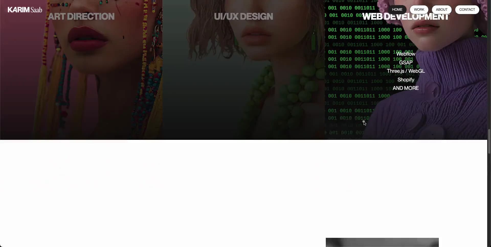
Create a full-width capabilities chapter using three equal portrait columns. Each column should feature a distinct original beauty/editorial portrait with its own visual treatment. Add a dark lower fade where text overlaps the image and place a large centered service title on each panel.

Suggested service themes:
- Art Direction;
- UI/UX Design;
- Web Development.

The third panel may include a small stacked list of relevant tools or technologies beneath its heading.

Continue with a white chapter containing one enormous irregularly masked or cut-out portrait. Use an original close-up with strong makeup or colour accents and a bold abstract shape behind the subject. Implement the silhouette using CSS masking, SVG clipPath or another standards-based technique. Preserve substantial white negative space around the figure.

End with a sparse white contact chapter:
- one centered dark pill action;
- small utility/contact links;
- thin rules;
- an oversized footer identity that is deliberately cropped by the viewport edge.

Combine heavy sans lettering with a contrasting editorial serif for the footer identity, using entirely original naming.

Typography:
- use a clean modern grotesk for utility text, navigation, service titles and large structural headings;
- use a high-contrast editorial serif for refined display phrases and the serif part of the footer identity;
- use detected font families only if they have been technically verified and licensing permits them.

For reconstruction, use semantic DOM for all text, navigation, rules, project metadata and footer content. Use CSS Grid/Flexbox for layout and standard image/video elements for media.

Use CSS/SVG masking for the opening and cut-out transitions. Canvas may be used only as an optional progressive enhancement if a specific transition cannot be reproduced efficiently with CSS. Do not require WebGL.

Support keyboard navigation, visible focus states, descriptive alt text and reduced-motion behavior. Preload only the hero poster and critical font resources. Lazy-load below-fold project and portrait imagery.

Do not add:
- generic agency cards;
- SaaS feature grids;
- testimonial carousels;
- excessive glass effects;
- dashboard UI;
- generic icon grids;
- 3D scenes;
- WebGL-heavy effects;
- unnecessary shadows.

The final result should feel like a compact, art-directed beauty/editorial portfolio where typography, portrait direction and project imagery carry the experience.
Create a free account to unlock all prompts
These prompts describe a visual language: composition, rhythm, type scale and motion. Build with your own branding, copy, logos and imagery — the design and content of Karim Saab — Portfolio belong to their authors.
Build Recipe
Framework
- Webflow· Detected
- React
Creative tools
- Nano Banana
- Recraft
Libraries
- GSAP· Detected
- Lenis· Detected
- GSAP
- Lenis
Special requirements
AI Replicability
84 / 100
Main remaining challenge
The design and branding of Karim Saab — Portfolio belong to their authors. InspoToCode documents its visual language as a reference; anything you build from it should carry your own branding, copy and assets.
Design analysis
- Pill navigation and primary action use fully rounded capsules; the rest of the composition is square-edged and editorial.
- Small, tightly padded monochrome pill controls with thin outlines; the current item reverses to a dark filled pill with white text.
- Avoid generic floating cards. Project media is presented as edge-to-edge rectangular image tiles separated by narrow white gutters.
- No visible decorative drop shadows; legibility comes from dark image overlays, contrast, and scale.
- Hairline near-black or translucent rules divide the hero footer strip and compact legal/contact rows.
- Alternates between vast full-viewport image fields and very compressed small-type utility rows; use generous vertical editorial pauses.
- The page largely occupies the full viewport width with roughly 16px desktop side inset for text, rules, and grids.
- A compact wordmark sits top-left while four small pill links align top-right over both light and dark sections.
- Saturated, tightly cropped fashion-beauty portraits with strong makeup, tactile styling, and colored studio grounds; lower portions often fade into black for text contrast.
- Use restrained black-to-transparent bottom overlays on photographic fields, rather than colorful UI gradients.
- A sequence of full-bleed visual chapters: splash, hero, white project index, three equal service portraits, sculptural cut-out imagery, then a sparse contact/footer lockup.



