Kinetic Black Slab Portfolio Intro
huyml.co
Studio
- Animation
- Editorial
- Light
- Minimal
- Monochrome
- WebGL
Palette
Typography
Primary
BT Grotesk MediumSecondary
F37 Bolton Trial RegularMono
BT Glyphius Regular
About this design
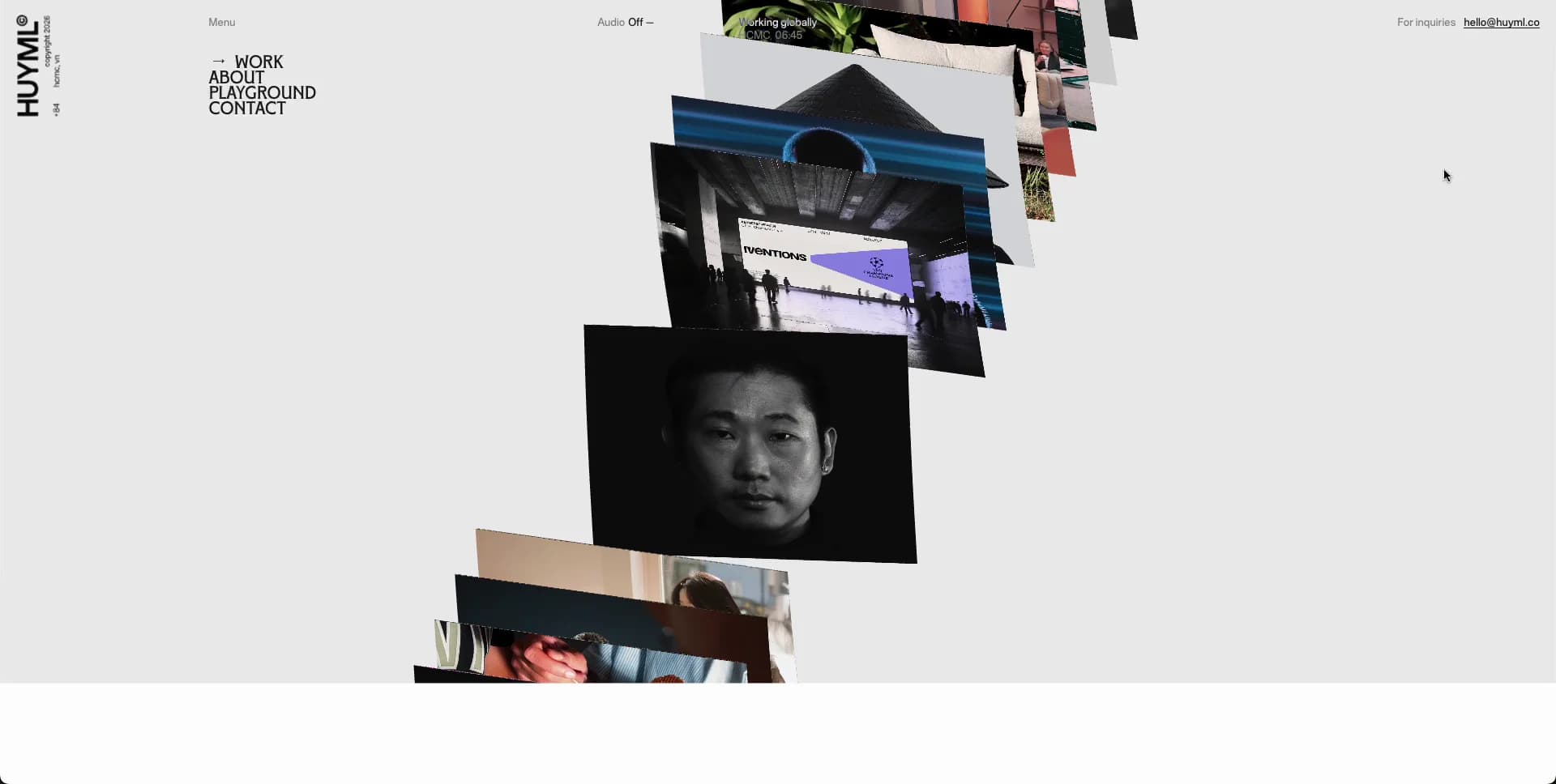
A designer portfolio that turns selected work into a continuously advancing, spatially layered stream of image cards, surrounded by a deliberately sparse editorial control system.
Prompts
Main build prompt
Build an original art-director portfolio experience whose signature is a tall procession of overlapping portfolio-image planes moving through a pale-grey fullscreen stage. Use the following dimensions and timings as reconstruction targets inferred from the reference, not exact measurements of the original implementation. Frame the desktop composition at 1920×968 (approximately 1.98:1), and preserve that wide ratio for any WebGL render target or fallback poster.

Use #e7e7e7 as the nearly full-page ground and #000000 for active text, image edges, and the strongest labels. Reserve #cccccc for inactive entries that should appear faint but readable; #1b1b1b may appear only in dark loading/media states. Make the page feel nearly borderless, shadowless, and square-cornered. Do not add rounded feature cards, a hero slogan, a client-logo strip, a testimonial carousel, decorative gradients, or a conventional masonry grid.

Lay out a fixed five-zone shell. At the far upper-left, place a narrow vertical identity rail around 30–44px wide with an original vertical wordmark and a small changing monochrome stamp/illustration beneath it. Around 135–165px from the left, place a tiny “Menu” label near the top and a compact four-item stacked navigation list around 42–54px below it; make each active item set in a condensed, emphatic grotesk at roughly 17–23px with tight leading. Center a small audio-status control near the upper fifth of the page. Place an availability/location micro-label around the x=48–52vw region. At top right, place a small enquiry cue and underlined generic email link about 38–55px from the right edge.

The center is not a static hero image. It is a depth scene containing roughly 10–18 flat rectangular artwork planes travelling along a mostly vertical path. At any instant, one strongest plane occupies roughly 210–290px wide by 145–220px high around x=40–55vw and y=35–65vh. Additional planes overlap above and below it, with some cropped by the viewport. They should have subtly different sizes, z-depth, and rotations, generally within about -10 to +10 degrees, so the ribbon reads as a physical stream of loose printed sheets. Keep their raw rectangular edges; do not put them inside UI cards. Use high-quality original or generated substitute work imagery: a moody face crop, people in a studio, an architectural/interior scene, an editorial product image, a dark abstract 3D form, and print/interface compositions. Vary crop and art direction while keeping all images cohesive enough to imply a single portfolio.

At right, build a vertically stacked project index approximately 270–340px wide, positioned at x=72–91vw. It should show about 5–7 items at once. Each item has an ultra-small category line, a larger all-caps or narrow project title around 16–22px, then a 1–3 line blurb around 9–12px. The selected item is black and the rest fade toward #cccccc. Align two or three 8–11px coloured square swatches to the selected item’s far right as a quiet project palette cue. Treat all words as original placeholder content; do not reuse a real person’s name, project names, contact information, or descriptions.

In the lower-left area, place a small “selected work” style label, a huge blurred two-digit index around 92–130px, and a tiny total-count suffix. The large number should be visibly soft/defocused and partly obscured by passing image planes, which makes the scene feel dimensional. Add a tiny scroll indicator closer to the lower-left edge and a compact underlined showreel-like action at lower right.

For reconstruction, use a WebGL canvas for the central artwork ribbon because texture planes, overlap, and deep clipping are central to the visual identity. Maintain a DOM data model for projects, then synchronize selected index, visible right-side item, swatches, media texture, and counter with a continuous scene position. A practical implementation can use a shallow perspective camera and texture-mapped planes; keep it restrained, with no glossy 3D objects, particles, lens flares, or dramatic camera orbit. Use DOM/CSS for all typography and controls so they remain sharp and accessible above the canvas. Layer order: background, canvas stream, blurred counter behind selected planes where needed, then fixed navigation and right index above the scene.

Start the experience with a brief stark loader: an almost black fullscreen field may slide or wipe away to reveal a white/pale panel and a large red, custom typographic greeting substitute plus a simple black line-drawn character. This initial illustration is optional after the first visit; it must be wholly original and should not include any original wording or branding. The main work browser then settles into the persistent pale interface.

On pointer hover, let the active image plane gain only a gentle scale increase around 1.01–1.03 and sharpen its project metadata; keep the cursor ordinary or use a minimal text cue. Keyboard users must be able to focus previous/next controls and project entries, get an aria-live selected-project announcement, and navigate the project sequence without depending on the canvas. Provide an HTML image-and-list fallback if WebGL cannot initialize. Respect reduced motion by replacing continuous depth travel with a static centered image and explicit next/previous transitions. Lazy-load nonadjacent artwork textures, keep compressed responsive image sources, pause rendering when offscreen or backgrounded, and constrain the render loop to a stable frame budget.
Build frontend
Structure the page around a ProjectStore holding an ordered array of original project records: id, category, title, summary, swatches, alt text, and asset variants. Keep selectedIndex, targetScrollPosition, currentScrollPosition, loaderDismissed, reducedMotion, and WebGL availability in a single top-level controller; do not let individual index rows own selection state.

Create AppShell for the pale viewport frame, then FixedIdentityRail, PrimaryNav, UtilityBar, WorkStage, ProjectIndex, WorkCounter, and CornerActions. WorkStage owns the canvas lifecycle and receives projects, currentScrollPosition, selectedIndex, and callbacks. Keep a semantically complete DOM SelectedProjectFallback inside WorkStage for failed or reduced-motion rendering. ProjectIndex should render real buttons in a list; props include project, active, index, and onSelect. The larger counter receives only selectedIndex and total.

Use CSS custom properties for palette, rail width, stage gutters, UI z-index levels, text opacity, and viewport-derived type scaling. Use CSS Grid for the fixed shell: a narrow left rail, a left navigation column, flexible center, and a constrained right index column. Position the lower counter and corner actions absolutely within the shell rather than making the canvas dictate layout. Use clamp() only for adaptation, not to turn the desktop spacing into generic fluid design.

For reconstruction, instantiate the WebGL renderer within a client-only component after mount. Generate one plane descriptor per project with image texture, base world position, rotation, crop transform, and depth order. Map continuous virtual scroll to plane y-position and selected project via the nearest plane to a chosen center focal band. Smooth target-to-current position in requestAnimationFrame, but keep all list text in React/Framer state changes only when the discrete active index changes. Resize the camera and renderer from a ResizeObserver; use devicePixelRatio capped around 1.5–2 for performance. Texture assets should be prefetched only for roughly two entries on either side of the active item.

Use Motion for DOM loader reveal, index emphasis, swatch opacity, and small hover transitions. Do not use it to animate every WebGL frame. Expose CSS-visible focus rings on the compact text controls, preserve buttons’ normal tab order, and trap no focus in the visual stage. Keep the canvas aria-hidden when equivalent project selection is present in the DOM.
Generate assets
Prepare an original set of roughly 18–25 portfolio-style artwork assets rather than sourcing recognizable client work. The set needs deliberate variety: tightly cropped monochrome portrait, people in an independent studio, desk/workstation scene, graphic poster or interface composition, dark abstract inflated forms, architectural scene, and tactile print/object detail. Generate or commission these as coherent editorial substitutes; Nano Banana is useful for creating consistent art-directed stills, but retain human review over crop quality and rights.

Export master images in the reference’s 1.98:1 family where an image fills a wide plane, for example 2560×1290 or 3840×1936. Also prepare near-square alternates around 1600×1600 and modest landscape crops around 2000×1400 because the stream visibly mixes formats. Preserve crops in asset metadata instead of baking every viewport crop into a new file. Supply AVIF or WebP primary files with JPEG fallback; target approximately 180–450KB for normal 2x texture sources after visual testing. Keep one low-resolution 32–64px blurred placeholder per artwork for immediate texture fill.

Images should remain rectangular with no alpha, feather, mock card background, rounded corners, cast shadows, embedded captions, or embedded brand identifiers. Apply any plane rotation, clipping, brightness adjustment, and depth opacity in the renderer, not in exported imagery. A few dark pieces are important to interrupt the pale field; avoid making all assets beige lifestyle photography.

Make the left-rail stamp separately as a small original black-on-transparent SVG, approximately 80–120px tall with a 1px outline feel. It can be a changing editorial pictogram or eccentric hand-drawn emblem, but must not resemble an existing logo or character. Use a compact SVG viewBox such as 0 0 100 180 and crisp vector strokes. Use live HTML text for the identity, labels, counter, metadata, navigation, and index; never rasterize these.

The opening loader, if included, needs only an original red display-word treatment and a separate black line illustration on an off-white panel. Export the illustration as editable SVG; build the display title from an appropriately licensed serif display face or custom CSS styling rather than reproducing any protected lettering. Keep the loader vector-only so it remains clean at the 1920×968 reference stage.
Add animations
Treat the continuous image procession as the primary motion. After the initial reveal, target a slow upward journey of the whole plane stream, with the central featured plane yielding to the next about every 0.8–1.4 seconds during an automatic showcase cycle. The sampled sequence suggests many project changes across roughly 4.5 seconds, so use a faster demonstration/autoplay mode around 0.7–1.0 seconds per index step if matching that energetic pass; slow it after user interaction. Use a single virtual travel value, eased toward its target each frame, to drive every plane’s world y-position and the active index.

For reconstruction, use requestAnimationFrame to interpolate scene progress with a gentle damping factor around 0.06–0.12 per 60fps frame, then render only while visible. Assign planes successive vertical spacing of roughly 1.0–1.6 plane heights, overlap adjacent planes by around 10–35%, and vary rotation subtly. As a plane enters the focal band, scale it toward 1; move more distant sheets toward about 0.75–0.94 visual scale and let clipping hide them at top/bottom. Keep rotations stable or drift them by less than about 1 degree; the effect is a moving stack, not floating cards.

When the nearest plane changes, animate the corresponding right index item from muted #cccccc toward black over roughly 180–300ms, while the former item fades back over roughly 250–400ms. Transition the small swatches with the same state. Animate the oversized lower-left number with a quick blur-preserving crossfade or vertical offset of roughly 8–16px; avoid a digit-counting effect. Hovering a canvas plane or its accessible index button should pause or strongly slow autoplay, set that item active, and subtly bring its plane forward. Clicking an index entry should drive the virtual position to its plane over roughly 650–950ms with a soft cubic-bezier-like deceleration.

The loader can begin as an opaque #1b1b1b fullscreen field. Around 1.2–2.2 seconds, wipe or slide an off-white panel in from left while revealing original red display lettering and black line art; then clear it into the portfolio stage over roughly 500–900ms. Keep this one-time transition sparse and silent unless the visitor explicitly enables sound.

Run DOM micro-motion through Motion: navigation and utilities should fade in with about 70–120ms offsets, never bounce. For reduced motion, show the same active central artwork in a static DOM image, retain the index and counter, and replace auto-travel with clear previous/next buttons plus an instant or 150ms opacity transition. Stop canvas animation on hidden tabs and when the stage is outside the viewport.
Responsive polish
Adapt the desktop composition rather than merely shrinking it. At widths above roughly 1200px, retain the full five-zone layout: identity rail, left navigation, center image stream, counter, and right index. Between approximately 760px and 1199px, preserve the fixed top utility labels but reduce the center artwork width toward roughly 180–250px. Collapse the right index to 3–4 visible entries with shorter summaries, move it slightly lower if it collides with the stage, and reduce the oversized counter to around 72–94px. Maintain meaningful empty space; do not fill the page with a full-width image grid.

For a proposed phone layout below roughly 760px, turn the stage into a vertical single-focus composition. Use a compact horizontal top bar with a small original identity mark at left, a menu button, and one utility action; hide the desktop vertical rail and lengthy location/audio labels. Place the active artwork as a large central rectangle around 70–86vw wide, with only fragments of preceding/following planes visible above and below. The WebGL stream can remain if it performs smoothly, but a DOM transform stack is an appropriate mobile fallback.

Below the artwork, show a concise active project block: category, title, 1–2 short summary lines, swatches, and a compact “current / total” counter. Replace the desktop right-side multi-item index with horizontally scrollable numbered project buttons or an accessible bottom sheet list. Keep each tap target at least about 44×44px. Position next/previous controls visibly, because a phone user cannot be expected to discover scroll-linked depth navigation.

At the smallest widths, target live type around 12–14px for metadata, 18–24px for project title, and 15–19px for main navigation. Keep the distinctive deep-stack signature through partial sheets and depth ordering, but reduce visible textures to perhaps 5–7 around the active work. Do not show blurred huge digits if they compromise legibility; use a smaller softly blurred numeral behind the image or a plain counter beneath it. Disable automatic advancement after a touch interaction, preserve reduced-motion behavior, and never hide the project list from keyboard or screen-reader access.
Final visual polish
The final pass should be about restraint. Align all fixed desktop labels to an intentionally small edge grid, roughly 24–42px from the frame, but make visual—not mathematical—adjustments where vertical lettering, underlines, or optical weight make a label look off. The left rail must feel like a printed margin, not a sidebar. Keep the center stream slightly off-perfect-center when required to balance the right project index.

Tune typography carefully: use the detected grotesk as the dominant UI voice with tight tracking and compact line-height, use the detected serif only for occasional contrast if needed, and reserve glyph-like lettering for tiny labels. Inactive index copy should remain low contrast without becoming inaccessible: on focus and hover lift it to near-black; ensure normal interactive text reaches usable contrast. Avoid anti-aliased text rendered into the canvas. Preserve sharp live type above moving media.

Inspect image-plane ordering at every active index. A first attempt often makes every plane equally spaced, equally rotated, and equally opaque; introduce measured irregularity in crop, angle, overlap, and depth while keeping the focal plane highly legible. Do not overdo perspective, blur, scale, or parallax. The reference feeling comes from a narrow vertical cadence through a calm field, not from spectacle. Ensure the blurred counter stays intentionally behind artwork and never appears like an accidental rendering bug.

Give all text buttons a 2px or equivalent high-contrast focus indicator that does not disturb the sparse layout. Use semantic nav, buttons for selection, alt text that describes each substitute image, and an aria-current state for the active project. Announce selected project changes politely but do not announce continuous scene movement. Ensure hover-only pauses are matched by focus behavior.

Prevent layout shift by reserving media dimensions before textures load, use async decoding for offscreen DOM fallback images, and preload only the opening central asset plus nearest neighbours. Cap renderer pixel density, release distant textures when memory is tight, and suspend the loop when inactive. Test at 1920×968 first: the most common fidelity failures will be a canvas that is too wide, an index that is too dark or too large, overly rounded UI, a generic portfolio grid replacing the moving stream, and substitute imagery that lacks enough editorial contrast.
These prompts describe a visual language: composition, rhythm, type scale and motion. Build with your own branding, copy, logos and imagery — the design and content of Kinetic Black Slab Portfolio Intro belong to their authors.
Build Recipe
Framework
- Framer· Detected
- Framer
Creative tools
- Nano Banana
Libraries
- Motion· Detected
- WebGL· Detected
- Motion
Special requirements
AI Replicability
85 / 100
Main remaining challenge
The design and branding of Kinetic Black Slab Portfolio Intro belong to their authors. InspoToCode documents its visual language as a reference; anything you build from it should carry your own branding, copy and assets.
Design analysis
- Effectively square: use 0–2px corners for media and controls; the outer viewport panel has only a barely perceptible soft corner.
- Text-first micro-controls, no filled pills. Use tiny 9–11px labels, black underlined contact affordance, and compact square colour markers.
- There are no conventional cards. Project imagery is presented as flat, borderless rectangular planes in a dimensional vertical stack.
- Avoid conventional drop shadows. Depth comes from overlap, perspective, image contrast, and occasional black image edges.
- Nearly borderless. Fine 1px black rules belong only to miniature logo/illustration treatments and tiny underlines.
- Extreme negative space: fixed edge labels sit about 24–42px from edges, while the center stage reserves broad empty side gutters.
- A full-viewport 1920×968-wide stage within a very subtle rounded frame; no centered max-width content wrapper.
- A vertical identity strip at upper left, compact stacked section links beside it, micro-status labels along the top, and an active project list at right.
- A changing sequence of varied editorial portfolio thumbnails: portraits, workspaces, abstract 3D forms, interfaces, and print-like compositions, cropped to mostly landscape or near-square planes.
- No decorative gradients; use flat pale grey ground and let contrast originate in the artwork.
- Asymmetrical five-zone composition: fixed left identity/navigation, muted lower-left counter, central WebGL image stream, top utility line, and a narrow right project index.



