MouthPad Product Landing Page
augmental.tech
Hardware
- Editorial
- Large type
- Light
- Minimal
Palette
Typography
Primary
Inter Tight
About this design
A remarkably disciplined hardware-product site that pairs oversized near-black typography, bright clinical whitespace, documentary video, and precise editorial rules to make an intricate assistive device feel direct and desirable.
Prompts
Main build prompt
Use the following dimensions and timings as reconstruction targets inferred from the reference, not exact measurements of the original implementation.

Build an almost-white, editorial product page for an original hands-free input device. Its signature is not a generic hero: it is the collision of an enormous, tightly set black statement with a centered, high-key close-up of a transparent custom oral device whose small warm copper/orange electronic core is the only naturally saturated visual note. Keep the desktop reference stage at 1920×968 (≈1.98:1) for all wide video/poster media; use a centered content column around 1,200–1,270px wide at this viewport.

Set the page ground to #fcfcfc and primary ink to #0b0b0b. Use Inter Tight throughout, with an Arial Narrow/Arial fallback. The headline should be approximately 64–76px, weight 700–800, line height ~0.92–0.98, tracking about -0.065em. Body copy is around 13–15px with ~1.2–1.3 line height; metadata, navigation, figure captions, and section labels are uppercase around 8–10px with restrained tracking. Do not introduce a second display font, color washes, gradients, decorative textures, rounded content cards, floating shadows, or a conventional feature-card grid.

Create a slim sticky header about 72–80px tall, white and separated from content by a faint #dcdcdc hairline. Align its contents with the editorial column: an original compact wordmark at left, 5–6 tiny uppercase links with an active underline, a black pill purchase button near the right, then a simple outlined bag/cart icon. Make its background opaque enough to remain readable over scrolling media. The button is compact, approximately 100–120px by 30–34px, white uppercase type, and a tiny arrow. Give every interactive item a visible keyboard focus outline.

Start the main page with a label and a horizontal rule, then place an original two-line product claim in the large black headline. Let it occupy the left two-thirds of the content column and leave deliberate empty space to the right. Place a clean isolated product image beneath, centered, approximately 360–500px wide, with a diffuse natural contact shadow baked into the image or created by subtle CSS. Follow with a long hairline and a compact one-paragraph explanation aligned to the left, not a centered sales block.

Continue as a sequence of editorial product chapters. Alternate short explanatory copy with a wide 16:8-ish documentary video/poster region, always retaining the wide 1.98:1 source-media composition when preparing source assets. Use video in normal document flow with native controls unavailable by default, a still poster fallback, captions/transcript access, and no autoplay audio. Add a section marker, a medium-large declarative heading around 38–48px, and an image/video of a person using the device. Then use three concise numbered feature rows: a tiny number column, a bold title around 28–34px, and a 13–15px supporting paragraph. Separate rows with faint full-width rules and preserve substantial 48–72px vertical padding.

Include an in-action video strip followed by a human-proof area: three muted-gray testimonial excerpts in desktop columns, roughly 22–28px text, with small uppercase attribution lines. Use an accessible manual carousel only if multiple quotes must rotate; otherwise render a stable grid. Follow with a press section headed by one huge quotation-like editorial statement, then a restrained grid of monochrome publication-style placeholder marks in #838383. Use original, non-trademarked placeholders.

Add a second product section introducing an original companion voice-input object. Place its large heading and short paragraph above a wide, pale-gray product photo where two devices sit on a tabletop. Below it, place a small underlined link. End with an FAQ split layout: left column has a large two-line question heading, right has grouped accordion rows with 1px dividers and plus/minus icons. Buttons must expose expanded state, work by keyboard, and smoothly reveal content without clipping.

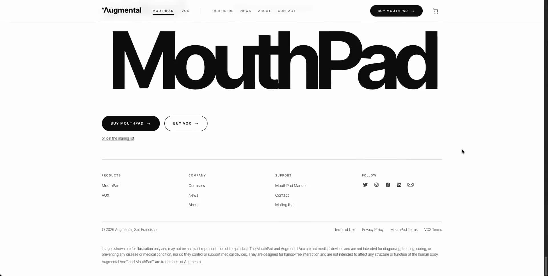
Finish with an enormous single-word or compound product-family name, around 130–190px on desktop, nearly touching the content edges. Under it place two pill CTAs, a small mailing-list link, a ruled multi-column footer, utility/legal links, and restrained tiny legal copy. The closing oversized lettering, not a colored banner, is the visual finale.

Use semantic header, nav, main, section, figure, video, button, footer, and heading hierarchy. Respect prefers-reduced-motion, lazy-load below-fold video posters, reserve aspect-ratio space for all media, and deliver usable low-bandwidth image/poster fallbacks. Keep all copy, branding, logos, product names, and photographs original to the rebuild.
Create a free account to unlock all prompts
These prompts describe a visual language: composition, rhythm, type scale and motion. Build with your own branding, copy, logos and imagery — the design and content of MouthPad Product Landing Page belong to their authors.
Build Recipe
Framework
- Next.js· Detected
- Next.js
Creative tools
- Nano Banana
- Recraft
- Krea
Special requirements
AI Replicability
85 / 100
Main remaining challenge
The design and branding of MouthPad Product Landing Page belong to their authors. InspoToCode documents its visual language as a reference; anything you build from it should carry your own branding, copy and assets.
Design analysis
- Controls are primarily pill-shaped; the main purchase button has a fully rounded capsule silhouette. Content panels stay square-cornered.
- Small black pill CTAs with uppercase white labels and a right arrow; secondary CTA is white with a thin black outline.
- Avoid conventional cards. Content is placed directly on the white ground and separated with full-width hairline rules.
- No visible decorative drop shadows; product photography supplies its own subtle contact shadows.
- Fine pale-gray horizontal rules define the header, section starts, feature rows, accordions, and footer columns.
- Very generous vertical whitespace around media; dense small navigation and labels contrast with large editorial gaps.
- A centered editorial column roughly two-thirds of the desktop viewport, with text and media aligned to the same left and right edges.
- A slim persistent white header: wordmark left, compact uppercase links, black purchase capsule, then a minimal cart icon.
- High-key product photography of transparent, custom oral hardware with a copper/orange electronic core; documentary stills and video add human proof.
- No decorative gradients are apparent; tonal depth comes from photographic lighting and neutral surfaces.
- Long single-column product narrative with alternating full-width media blocks, concise copy, two-column explanatory rows, press logo grids, FAQ split layout, and a large-type footer.



