Nudot Studio
nudot.com.tw
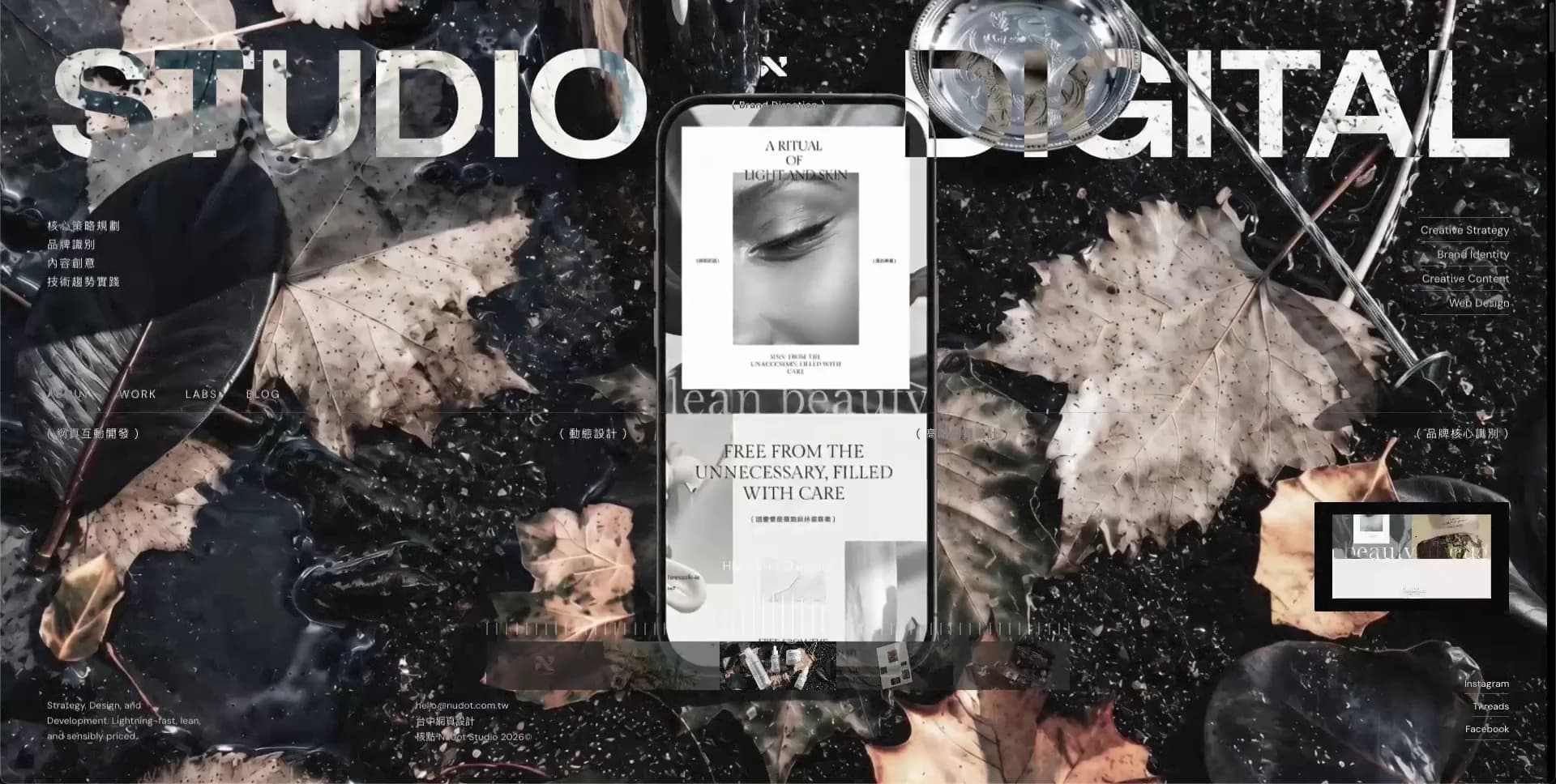
Studio
- Animation
- Dark
- Editorial
- Large type
- Minimal
- WebGL
Palette
Typography
Primary
DM SansSecondary
Zalando Sans SemiExpandedMono
Bitcount Grid Single
About this design
An immersive creative-studio landing experience that treats a full-bleed WebGL portfolio montage as an art-directed stage, overlaid with monumental split typography, fine editorial navigation, project indicators and a restrained data-like UI.
Prompts
Main build prompt
Create an original immersive portfolio landing page whose signature is a fixed, oversized split masthead over a constantly evolving full-viewport visual stage. Use the following dimensions and timings as reconstruction targets inferred from the reference, not exact measurements of the original implementation. Frame the desktop composition at 1920×968 (approximately 1.98:1); all stage imagery, canvas render targets, video posters and fallback images should retain that wide ratio, for example 2560×1290 or 3840×1936.

Build a full-bleed dark-to-light art-directed stage behind a persistent editorial HUD. The background should transition between at least three original visual worlds: a near-black glossy mineral/chrome object field; a pale floating geological garden with moss, translucent fungi, petals and slow drifting particles; and a high-contrast distressed still-life/editorial composition with paper, ink, leaves and a phone-shaped object. Make original assets or generate/licence fresh substitutes; do not use another studio’s logos, writing or project artwork. A practical recreation uses Three.js for the scene layer, with a DOM HUD above it. Use full-width poster images or short original video loops as a lower-capability fallback.

Pin two enormous uppercase sans-serif words to the upper edge, one aligned left and one aligned right. At desktop, target roughly 94–106px type, weight 700, tight negative tracking around -0.06em, and a line height near .8. Leave a central gap of about 120–180px for a small abstract own-brand mark plus a micro-label. On dark scenes make the masthead chalk-white (#fbfbfb); on pale scenes let it become graphite (#3c3b3c). Preserve the exact same headline geometry as scenes change so the visuals appear to move beneath an institutional frame. Use an expansive grotesk such as Zalando Sans SemiExpanded for the display treatment and DM Sans for UI text. Use the grid-like mono face only for counters, markers or tiny technical labels.

Lay a transparent technical grid over the scene: a fine horizontal rule around 27–29% viewport height, a second information zone in the lower third, and a near-invisible vertical center axis. Set rules to a scene-aware 15–28% opacity. At left around 25–28% viewport height, place a 4-item navigation in 9–11px uppercase with ~.12em tracking. Above or beside it put a short three-to-four-line service list in your own language. At right, place a similarly compact four-line capability list near the top third, a bracketed section cue near the central rule, a 128×72px-ish preview tile around the right-middle/lower area, and three small social labels beneath. Use original labels only.

At center-lower, add a project index such as “02 / 05”, a tiny category label, and an active row of roughly 25–34 narrow vertical ticks. Beneath it, set a horizontal thumbnail rail about 360–470px wide and 32–44px tall, composed of six to eight small original scene thumbnails in a translucent dark strip. Add very small contact/legal text at the bottom-left. Keep all peripheral text deliberately quiet: around 8–10px, white or graphite at 60–80% opacity.

The scene should be the movement, not the HUD. Start on a dark composition, then over approximately 2–4 seconds introduce reflective spheres and a central faceted mark/object. Transition over about 1–2 seconds into the pale botanical island through a controlled bloom, zoom and reframing; have flowers, motes and droplets cross in front of the masthead while the text stays sharp. Let the island slowly rotate or camera-drift for several seconds, then switch to a grainy, more graphic black-and-white editorial world with a brief RGB edge split and noisy texture. A small dotted cursor trail or animated right-angle path can intermittently arc around the center; keep it subtle and purposeful. Use GSAP for timeline coordination and the available smooth-scroll library for scroll feel, but use time-based scene changes only if no scroll narrative is needed.

Render the stage beneath all text. Place the scene at z-index 0, a low-opacity contrast wash at z-index 1, grid lines at 2, HUD text at 3, and pointer path/interaction feedback at 4. Protect readability dynamically: use a gentle translucent wash behind small labels or calculate a light/dark HUD theme per scene. Do not add rounded SaaS cards, gradients as decoration, large CTA pills, feature grids, testimonials, cookie-style popups or soft drop shadows.

For interaction, make thumbnails and side preview select original scenes; on hover, brighten the chosen thumbnail, update the index/title and crossfade or camera-transition the stage. On pointer move, apply only a slight parallax/camera bias, roughly 2–4% of the stage width. Support keyboard selection through focusable thumbnails, visible focus rings and left/right arrows. Give the canvas an accessible text alternative describing the currently selected original project. Respect prefers-reduced-motion by showing a stable poster scene, preserving manual project selection, and replacing sweeping camera motion with a 180–250ms opacity transition. Keep initial page content functional before the 3D assets finish loading, limit DPR on mobile, pause offscreen rendering, and serve compressed textures and responsive posters.
Build frontend
Structure the page as a single `ExperienceShell` that owns active project ID, HUD contrast theme, reduced-motion status and pointer coordinates. Render `SceneStage` as the lowest layer; it receives a normalized scene descriptor (`id`, `poster`, `model`, `palette`, `label`, `preview`, `thumbnail`, `cameraPreset`) and exposes loading/progress callbacks. Keep Three.js objects, renderer lifecycle and requestAnimationFrame loop inside this component so UI state changes do not rerender the render loop.

Build DOM overlay components separately: `Masthead` for the two display words and central own-brand mark; `HudGrid` for hairlines; `LeftRail` for service text and primary navigation; `RightRail` for capability text, preview and external links; `ProjectNavigator` for count, tick scale and thumbnail buttons; and `FooterMeta`. Feed these from an original content configuration rather than hardcoding copy. `ProjectNavigator` should be a roving-tabindex tablist with arrow-key selection, and dispatch `onProjectSelect(id)` upward.

Use CSS custom properties on `ExperienceShell`: `--hud-fg`, `--hud-muted`, `--rule`, `--wash`, `--page-pad`, and `--display-size`. Change theme using a data attribute per scene rather than conditionally styling each label. Use a fixed, inset-zero stage and a fixed/inset-zero overlay. Implement the HUD grid with CSS Grid using columns such as 1fr auto 1fr, plus absolutely positioned rails where that makes optical placement simpler. Do not use a conventional card layout.

For scene swaps, retain current and incoming scene resources concurrently; drive a `transitionProgress` uniform or overlay opacity rather than unmounting the current stage abruptly. Isolate media preload, texture disposal and quality tier selection in a `sceneManager` module. Use transform and opacity for DOM transitions, avoid reading layout each pointer event, and publish pointer values through refs. A no-WebGL route should render the same DOM HUD over an `picture` poster layer and preserve project navigation.
Generate assets
Create a fresh asset pack rather than borrowing portfolio imagery. Prepare three to five wide scenes at 3840×1936 for high-density desktop posters, then produce AVIF/WebP derivatives around 2560×1290 and 1920×968. Each scene needs a matching 16:8-ish preview crop around 640×360 and a thumbnail crop around 160×90; keep crop focal points clear of the top masthead and lower navigator regions.

For the dark scene, model or generate an original black basalt/plastic surface, reflective glass beads, a faceted abstract icon and a dark phone-like slab with no recognisable UI. For the botanical scene, use an original floating porous-rock diorama, dense moss, semi-translucent mushrooms, petals and a few floating droplets. Export it as a glTF/GLB with separate rock, foliage, hero fungi and particle groups; bake broad lighting/AO into textures, but retain subtle emissive and opacity response in material settings. For the editorial scene, create an original arrangement of monochrome leaves, paper fragments, ink/grain and an abstract product object; use a generated or self-shot print layout with invented text.

For WebGL, use KTX2/Basis-compressed colour, normal and ORM maps where practical, power-of-two textures up to about 2048px for interactive geometry, and a 3840×1936 still poster while models load. Avoid giant transparent PNG scene exports. Use alpha PNG or SVG only for the small abstract own-brand mark and UI ornaments; build lines, ticks and dotted-path geometry in CSS/SVG. Make the mark an original simple geometric SVG with a tight viewBox, not a copied logo.

Keep imagery graded independently from the HUD: pale scenes need cool gray sky, muted green moss and restrained peach/violet flower accents; the dark set should lean near-black wine, charcoal and off-white highlights. Add grain/chromatic splitting as shader or CSS treatment rather than baking it permanently into every master. Include meaningful alt text for each project’s poster, while canvas descriptions should name only the invented project category and visual subject.
Add animations
Treat the experience as a 12–14 second looping art-directed sequence plus explicit project selection. Use a GSAP master timeline to coordinate DOM and stage parameters, while the WebGL render loop only updates camera, particles, uniforms and pointer smoothing. Start with a roughly 600–900ms reveal: masthead fades or resolves in quickly, perimeter labels arrive at 70–120ms stagger, and the thumbnail rail settles upward by about 10–16px. Keep the HUD nearly stationary once visible.

For the first scene, slowly drift the camera and rotate the central abstract object over roughly 3–5 seconds; reflective beads may float on independent 5–9 second loops with extremely small amplitudes. Move to scene two through a target ~900–1500ms transition: crossfade background lighting, blend a noise/displacement mask, push camera forward slightly, and shift the HUD foreground from off-white to graphite once the pale scene is dominant. Hold the botanical world for around 4–6 seconds. Let petals, spores and droplets move at varied 6–12 second rates with slight depth parallax; cap particle count and use instancing.

Transition into the editorial still life with a short 500–900ms glitch: temporary RGB channel separation of roughly 2–6px, opacity noise and a brief scale jump under 3%. Do not continually glitch text. Use the occasional dotted pointer route as a 700–1100ms SVG stroke-dashoffset animation triggered after a scene settles or on project hover. On thumbnail hover, brighten the tile over about 160ms and lift it 2–3px; on selection, update title/count in ~180ms and initiate the larger stage transition.

Smooth pointer input with a damping target around 0.06–0.12 per frame; map it to modest camera/object movement, never cursor-chasing rotation. Run rendering only when visible, clamp to a sensible DPR, and aim to keep the animation frame budget near 16.7ms on capable desktop devices. For reduced motion, keep a static selected poster, retain 150–220ms crossfades for manual project changes, show the active tick and thumbnail state, and omit camera drift, particles, glitching and cursor trails.
Responsive polish
Adapt the desktop HUD rather than merely shrinking it. Above roughly 1200px, retain the full wide stage, split masthead and both side rails. Around 768–1199px, use a 24px-ish page inset, reduce display type to approximately 64–76px, narrow the central masthead gap, hide the long right-side capability list, and move the preview tile closer to the lower-right navigator. Keep the scene wide and let the botanical object crop at its edges rather than shrinking it into a contained card.

Below roughly 767px, design a deliberate portrait adaptation. Keep the stage as a fixed cover background with mobile-specific 9:16 or 4:5 source crops of the original scenes; do not stretch a 1.98:1 image to fill the phone. Set the two headline words on separate rows across the upper area at about 15–19vw, tightly tracked, with the small mark between or beneath them. Apply a stronger, scene-aware wash behind microtype because crop density will be higher.

Replace the left rail navigation and right social/capability stacks with one compact menu trigger in the top-left or top-right, with a 44×44px minimum touch target. Keep only one short category label, a count, and the thumbnail navigator in the lower quarter. Turn the thumbnail strip into a horizontally scrollable rail with snap points; make each tile about 72–96px wide and preserve clear selected state. Move preview media into the selected thumbnail or remove it from the base composition rather than stacking another card.

On phone, reduce particle density and use poster imagery by default on low-power devices; manual project selection must continue to work without hover. Use tap to select and a second tap or dedicated action to open project details. Preserve keyboard focus order for connected keyboards, respect safe-area insets, and use no text below about 10–11px. The signature must survive as giant type anchored over an animated or gently crossfading art scene, not as a generic vertical marketing layout.
Final visual polish
Tune the masthead optically, not just mathematically: the left word should feel flush with the left inset and the right word flush with the right inset despite glyph side bearings. Use the detected display family where available, test its heaviest weight for clean counters, and tune tracking by eye so the two words read as one typographic structure. Keep microtype sharply rendered with restrained tracking; avoid scaling it with CSS transforms.

Audit every scene for HUD contrast. On very pale backgrounds, use graphite primary text and rules; on dark backgrounds, use #fbfbfb. Ensure essential controls meet contrast expectations even if decorative service lists remain subdued. Use a 2px highly visible focus outline with a small offset for nav, project tabs and external links; preserve DOM order that matches top controls, project selector and footer metadata.

The first attempt will commonly make the headline too small, the interface too opaque, the grid too visible, the thumbnails too card-like, and the 3D object too centered/clean. Correct toward enormous edge-cropped type, hairline rules at low opacity, small flat media strips, atmospheric depth, foreground particles and imperfect editorial texture. Keep any glitch moment isolated and short; the calm institutional overlay is what makes the imagery feel controlled.

Preload the current poster and next project’s compressed preview first, then defer larger scene resources. Reserve fixed dimensions for thumbnail and preview slots to prevent layout shift. Crossfade loaded imagery rather than flashing transparent canvas. Test the experience at high and low DPR, with slow network, WebGL disabled, keyboard-only navigation, reduced motion and pale/dark scene switches. Use a stable poster plus the complete navigable HUD as the resilience baseline, not a blank loading screen.
These prompts describe a visual language: composition, rhythm, type scale and motion. Build with your own branding, copy, logos and imagery — the design and content of Nudot Studio belong to their authors.
Build Recipe
Framework
- React or vanilla component architecture
Creative tools
- Higgsfield
- Nano Banana
Libraries
- Three.js· Detected
- GSAP· Detected
- Lenis· Detected
- Three.js post-processing
- GLTFLoader
- CSS Scroll Snap fallback
Special requirements
AI Replicability
78 / 100
Main remaining challenge
The design and branding of Nudot Studio belong to their authors. InspoToCode documents its visual language as a reference; anything you build from it should carry your own branding, copy and assets.
Design analysis
- Almost entirely square geometry. The main side preview is a sharp rectangle; use only tiny ~0–3px radii where anti-aliasing requires it.
- Controls read as small uppercase text labels, hairline rules, bracketed labels and discrete graphic marks rather than filled CTA buttons.
- Avoid conventional cards. The only card-like element is a small right-side project preview, treated as a flat framed media tile.
- No soft UI elevation. Depth comes from the rendered scene, dark translucent overlays, contrast and occasional media glow.
- Fine low-contrast horizontal and vertical rules create a technical editorial grid; use translucent light or dark strokes according to the scene.
- Dense edge annotations contrast with broad central breathing room. Use a roughly 28–34px outer desktop inset and a tightly spaced microtype rhythm.
- The interface occupies the whole viewport, with overlays aligned to a near-full-bleed grid rather than a centered content max-width.
- A compact horizontal text nav sits at left around the middle of the viewport; project preview and social links are stacked on the right.
- Full-bleed cinematic 3D stills and graphic editorial collage, with high detail, grain, chromatic aberration and selective defocus.
- No decorative UI gradients; use lighting gradients, haze, translucent black washes and scene-dependent contrast protection.
- A persistent HUD overlays an animated full-bleed stage: oversized two-part masthead at top, scene at center, metadata and navigation around the perimeter, timeline and thumbnails along the lower third.