Olivier Ouendeno — Digital Art Director Portfolio
olouen.com
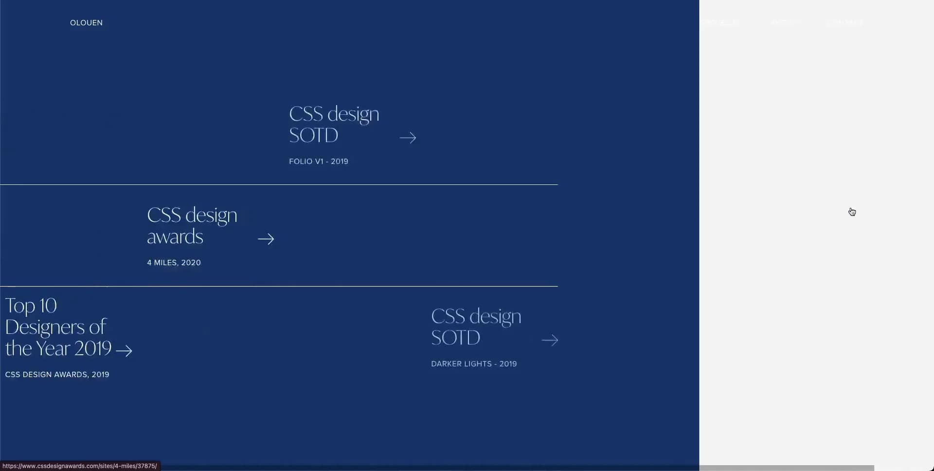
- Animation
- Editorial
- Large type
- Light
Palette
Typography
Primary
IvyModeSecondary
proxima-nova
About this design
A Paris-based digital art director portfolio that stages projects, credentials and contact details as a single editorial sequence of oversized serif typography, sparse navigation and sliding colour fields.
Prompts
Main build prompt
Create an editorial portfolio for a digital creative using a kinetic, full-viewport sequence rather than a conventional stacked marketing page. Use the following dimensions and timings as reconstruction targets inferred from the reference, not exact measurements of the original implementation. Frame the desktop experience at 1920×968 (approximately 1.98:1), with every full-bleed video, poster or transition surface preserving that wide ratio.

Lead with the signature: oversized high-contrast serif phrases should appear partially cropped, slide across broad fields of paper white, deep blue, petrol teal and muted aubergine. Pair them with tiny uppercase sans-serif navigation and isolated project-image rectangles. The design must feel like an animated fashion/editorial spread: mostly empty space, no cards, no gradients, no pill buttons, no drop shadows, no feature grids, no testimonial carousel, and no generic centred hero-plus-CTA formula.

Build a fixed or visually persistent top header around 24px from the top and roughly 76px from both desktop edges. Place a short custom wordmark at left in a ~9–10px uppercase sans. Place three compact navigation labels at right, around 12–16px apart. Give the selected link a fine 1px underline offset about 3px below its baseline. Use genuine semantic links, visible keyboard focus, and a header colour that adapts for contrast over pale or saturated panels.

Start with a pale #f2f2f2 opening surface. Construct the introductory composition as large fragments of a serif greeting/name/role, around 64–82px on desktop with a tight ~0.95–1.02 line height, scattered across the central 65% of the viewport. Let a few ghosted fragments sit at about 8–22% opacity and allow edge cropping. Introduce a compact portrait image near the right side, roughly 260×330px, with an approximately 6px radius. The visual hierarchy is headline first, then image, then navigation; metadata is tertiary.

Create a project chapter using the same pale field and a central serif heading around 64px. Arrange 3–5 original substitute images like a moving contact sheet: a landscape crop entering from the upper left, a portrait or square crop around the right-middle, and another pale partially obscured image at lower left. Use art-directed replacement material: luxury objects, editorial photography, illustrated travel scenes, craft detail, architecture or restrained product still life. Keep images between roughly 180–390px wide and avoid recognisable external logos. Media should float in space instead of living in tiles.

Follow with numbered editorial chapters. On saturated #105f6c, #3f3057 and #133165 grounds, use a pale serif section number around 26px above a large two- or three-line statement around 60–76px. Place the text substantially left of centre, leaving the right half sparse for faint details, thin rules, small image slivers or low-opacity labels. One chapter can use vertical 1px dividers to imply empty columns. A credentials chapter can show understated ruled list rows. End on paper white with a centered large contact heading, a small vertical monochrome image near upper left, a brief paragraph in compact sans near lower centre, and large underlined contact links toward lower right. Use entirely original label and contact text.

Use semantic sections with IDs for the three navigation destinations. Use DOM elements, native images and CSS transforms; a full-width background video is appropriate only if it supplies an abstract, self-authored moving texture, and should match 1920×968 or another ~1.98:1 export. Preserve legibility with semantic headings, descriptive image alt text, sensible tab order and a reduced-motion mode that replaces sweeping movement with short fades and immediate readable final positions. Preload only the opening media, lazy-load below-the-fold imagery, reserve image dimensions to prevent layout shift, and keep animation transform/opacity-only where possible.
Create a free account to unlock all prompts
These prompts describe a visual language: composition, rhythm, type scale and motion. Build with your own branding, copy, logos and imagery — the design and content of Olivier Ouendeno — Digital Art Director Portfolio belong to their authors.
Build Recipe
Framework
- Nuxt· Detected
- Nuxt
Creative tools
- Nano Banana
Libraries
- GSAP
Special requirements
AI Replicability
87 / 100
Main remaining challenge
The design and branding of Olivier Ouendeno — Digital Art Director Portfolio belong to their authors. InspoToCode documents its visual language as a reference; anything you build from it should carry your own branding, copy and assets.
Design analysis
- Images use subtle rounding, roughly 4–8px; the surrounding interface and colour panels remain square and architectural.
- Text-only navigation and links with a thin underline as the active/hover indicator; no filled CTA buttons.
- Avoid card components. Project media are free-standing editorial rectangles placed asymmetrically in the open field.
- No visible decorative shadows; separation comes from large flat colour planes and image contrast.
- Fine 1px rules and underlines are used sparingly for active navigation, links and list divisions.
- Extreme negative space, with large viewport-relative offsets around headings; compact utility navigation contrasts the expansive content.
- Full-bleed viewport sections. Header content sits roughly 76px from each side at desktop, while editorial content intentionally breaks conventional containers.
- Small uppercase wordmark left; three small uppercase links right. The active item receives a short dark underline.
- Small to medium portrait and landscape project images sit as isolated, softly rounded crops; use original or generated art-direction samples rather than branded client work.
- Predominantly flat fills; do not introduce gradients.
- A kinetic editorial layout: full-screen sections, oversized left/centre headlines, off-grid media, and split-screen wipes between pale and saturated colour fields.



