Sasha Martynchuk Portfolio
sashamartynchuk.com
Studio
- 3D
- Animation
- Dark
- Editorial
- Large type
- WebGL
Palette
Typography
Primary
Neue MontrealSecondary
Arges
About this design
A dark, WebGL-led product-design portfolio that turns an approach section into a sequence of immersive visual metaphors: drifting portfolio tiles, particles, liquid neon forms, a glowing object, and falling sticker ephemera.
Prompts
Main build prompt
Build an original dark product-designer portfolio experience whose signature is a full-viewport, wide WebGL stage that changes through distinct visual metaphors behind sparse centered editorial typography. Use the following dimensions and timings as reconstruction targets inferred from the reference, not exact measurements of the original implementation. Frame the desktop stage at 1904×968 (about 1.97:1); preserve that ratio for all generated scene textures and canvas exports, for example 2560×1302 or 3840×1952.

Make the root a near-black (#010101) fixed-height stage with overflow hidden on desktop. Render a full-bleed WebGL canvas at z-index 0 and overlay content at z-index 10; top chrome must remain at z-index 30. Place an original white handwritten-style wordmark at roughly 24–32px from the upper-left corner, a tiny contact email at the matching upper-right position, and a compact centered navigation pill approximately 26–34px below the top edge. The pill is a #242424 translucent capsule about 150–175px wide and 28–34px tall. Include four short links such as Intro, Process, Work, About; render the current link as a small #fcfcfc capsule with dark text. Use semantic nav buttons and ensure every state has a meaningful accessible heading outside of the canvas.

The intro scene is an apparent moving camera through a loosely spaced, full-bleed grid of about 12–20 original portfolio-preview tiles. Each tile is an independently created product-interface or editorial mockup—not copied client work—inside a large rounded rectangle. Let the black gutters stay visually strong. From the center-lower region, overlay a tiny white descriptor line, a huge all-caps condensed display title around 76–110px at this desktop width, then a pale cursive location or role flourish crossing the title’s lower edge. Use Arges for display type, Neue Montreal for navigation and body copy, and Signature only for the handwritten secondary flourish. Keep the display title high contrast and tightly tracked; the scene remains legible even as tiles pass behind it.

Create a Process/Approach route or staged sequence with four centered text states. Each state has a huge condensed all-caps single-word heading, around 56–76px, in #fcfcfc, and a small centered three-to-four-line explanatory paragraph roughly 12–14px wide-set beneath it. Do not reuse original wording; write concise original process statements. The text layer is stable and restrained while its environmental canvas scene becomes the point of view.

First process scene: a dark, dusty field of floating gray-white circles, about 20–45 visible at a time, from pinpoints to roughly 18–55px. Include blurred oversized bokeh blobs, sparse tiny specks, and barely perceptible smoky depth. Second: transition away almost all particles, retaining a few cropped circles and thin drifting filament trails against empty black before revealing a black-blue scene bordered and punctuated by wobbly electric magenta-and-cyan liquid contours. The liquid has soft bloom and a large irregular loop near the middle, not a polished generic gradient.

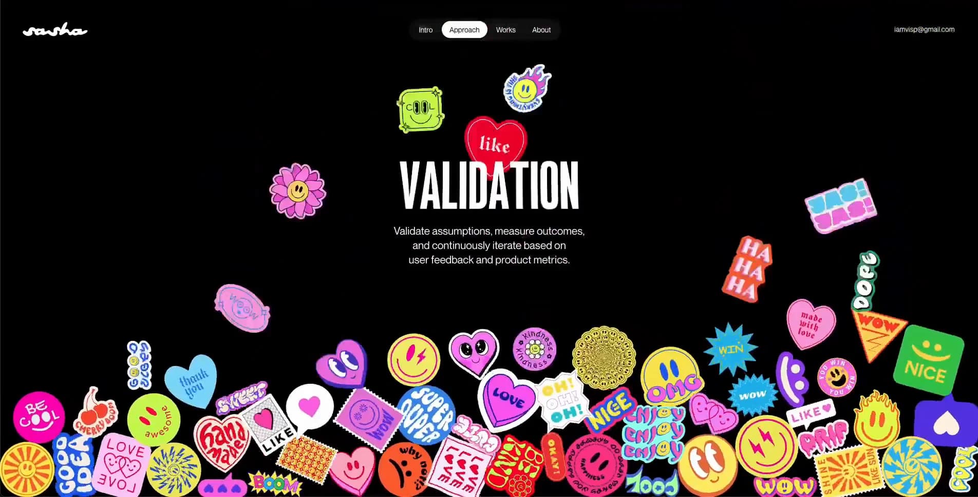
Third: construct an enormous softly rounded trapezoidal or monolithic slab floating from the upper center, cropped by the top edge. It glows with an internal red-to-magenta-to-blue-to-cyan light field, surrounded by low blue/red atmospheric haze. Keep the environment dark enough that the centered title remains crisp. Fourth: make a black scene where around 35–70 vibrant hand-drawn sticker illustrations drift around the centered text, then descend and accumulate as a dense irregular pile along the bottom fifth of the viewport. Stickers should be original vector-like charms—smiley faces, hearts, suns, comic bursts, playful letterforms—and carry distinct high-saturation pink, yellow, red, cyan, lime, purple, and orange fills with dark outlined edges. Retain a few slow floaters across the upper field as the heap settles.

For reconstruction, use Three.js for the canvas scenes. Use a single renderer and swap scene controllers rather than mounting multiple canvases. Add bloom, soft depth haze, and carefully limited noise only where a scene needs it. A practical way to make the portfolio-tile intro is camera motion across planes in 3D space; use original mockup raster textures with mipmaps, dimming or blurring distant tiles. Use DOM/SVG for all readable text and navigation, never canvas text, so zoom, selection, keyboard navigation, and screen readers work. Keep all canvas scenes decorative with aria-hidden=true and mirror scene intent in route headings and descriptions.

Transitions should feel like continuous environmental transformations, not hard route cuts: fade the old scene while its objects drift or dissolve, then bring in the next scene during roughly 800–1400ms. Let pointer movement gently perturb camera/parallax or scene forces, but do not turn the page into a game. Provide visible hover and focus states for navigation. Respect prefers-reduced-motion with static but composed fallback art: a still tile mosaic, a particle poster, a neon contour poster, a luminous slab, and a sticker pile poster. Keep initial canvas assets lazy-loaded after chrome and text; pause rendering in background tabs and reduce DPR on constrained devices.

Do not add a conventional feature grid, rounded white content cards, stock portrait hero, testimonial carousel, long drop shadows, large gradient CTA buttons, or generic glassmorphism. The disciplined black field, compressed typography, persistent top chrome, and scene-specific visual worlds are essential.
Build frontend
Structure this as a React application with a single StageShell that owns the fixed viewport, top chrome, route/scene state, reduced-motion preference, and pointer coordinates. Render <TopChrome wordmark contact items activeItem onNavigate /> separately from the visual system so it remains stable during scene replacement. Render <StageCopy eyebrow title body flourish /> as semantic DOM content above the renderer; accept a title scale variant and optional flourish slot. Keep all user-authored portfolio content in a typed scene manifest, with id, nav label, title, description, sceneType, fallbackPoster, and optional previewTextures.

Create a CanvasStage component that initializes one Three.js renderer and receives the current scene manifest. Scene controllers should implement mount(resources), update(delta, pointer), resize(size), enter(), exit(), and dispose(). Isolate IntroMosaicScene, ParticleFieldScene, LiquidContourScene, GlowMonolithScene, and StickerPileScene in individual modules. Share renderer configuration, texture loading, resize behavior, color management, and a small postprocessing setup through a scene runtime; avoid passing Three.js objects through React state. Use refs for the renderer and requestAnimationFrame loop, React state only for scene selection, loading, and interaction intent.

Use CSS custom properties for ground, ink, chrome, muted ink, viewport padding, nav height, and text widths. Use CSS grid or absolute inset layers for StageShell; the canvas is absolute inset:0, copy is a centered flex column, and top chrome uses a three-column grid so the centered nav does not shift when left/right content widths differ. Load the three supplied font families through @font-face or the project’s font loader, then define display, sans, and signature tokens. Keep canvas texture paths abstracted through an asset registry.

For stickers, build a data array with each SVG asset, initial position, scale, rotation, and settling target. Render their bodies as textured planes or sprite instances within the canvas; a DOM overlay alternative is acceptable if it better preserves sharp sticker edges. Use a simple state machine: intro, enteringProcess, listening, focus, craft, validation. Navigation updates scene state, URL hash, aria-current, and focus management. Include a CSS-only poster fallback when WebGL initialization fails.
Generate assets
Prepare only original or properly licensed substitutes. The opening mosaic needs about 12–20 high-quality fictional interface and editorial images, ideally exported as WebP or AVIF in varied portrait, square, and landscape crops. Source designs should resemble credible dashboards, mobile flows, landing pages, charts, and data tables but must use invented brand marks, invented data, and independently authored layouts. Export source imagery at roughly 1600px on the longest edge, then create GPU-friendly variants around 1024–1600px; preserve alpha only where truly needed.

Create five fallback posters matching the wide reference ratio, 1904×968 or a proportional higher-resolution equivalent. The particle poster should be mostly black with layered soft monochrome circular forms. The liquid poster needs a near-black navy field and irregular organic contour loops with cyan, violet, and hot-pink emissive edges. The glowing-object poster needs one large rounded trapezoidal luminous object with red, magenta, blue, and cyan light, not a flat background gradient. Bake heavy atmospheric blur and grain into posters rather than running expensive filters in fallback CSS.

Build a reusable original sticker pack of about 50–80 illustrations. Use Recraft or hand-authored SVG: each sticker should have an irregular outer silhouette, saturated fill regions, a 2–4px dark or pale outline at its native artboard size, and a compact viewBox with no excessive transparent padding. Include hearts, friendly faces, sunbursts, comic bubbles, abstract badges, fruit-like motifs, and short invented non-brand words. Avoid recognizable commercial iconography and copied sticker art. Export individual SVGs plus a generated 2x PNG/WebP atlas if instanced canvas rendering is chosen. Ensure each has enough variation in silhouette, colour, and orientation to avoid obvious repetition.

Use Nano Banana only if needed to generate the fictional product preview materials; keep typography and UI details edited in your design tool afterward rather than relying on AI-rendered interface lettering. Canvas-side treatments should include mild color desaturation for distant mosaic tiles, bloom for emissive scenes, and scene-level vignette. Keep source SVG stickers unblurred; apply lighting, shadow, or motion blur in render code. Preload only the first mosaic textures and defer the sticker atlas until the validation scene is requested.
Add animations
Use one requestAnimationFrame loop in CanvasStage, clamp delta time after tab restores, and aim for a roughly 16.7ms desktop frame budget; lower renderer pixel ratio toward 1–1.5 on dense screens when frame time rises. Treat the 0–12.5s clip as evidence of rapid scene evolution rather than an exact timeline. Initial intro should establish the tile field immediately, then make the camera glide forward and laterally over roughly 1.5–3s when entering a selected state. The display copy can fade from 0 to full opacity in about 450–700ms with a slight 8–16px upward settle.

For scene swaps, keep text and chrome legible. Crossfade scene layers over roughly 900–1400ms, with old geometry sinking into black during the first half and incoming geometry blooming in during the latter half. Use an easing recommendation such as cubic-bezier(.22,.8,.24,1), then tune visually. Avoid snapping the background on nav click.

Particle state: move small points in low-speed individualized orbits and drift; vary their depths so nearby blobs pass more quickly. Give the largest blurred discs a very slow 6–12s path and let smaller points move at different phases. Do not make all particles pulse together. During the fade-out, pull most circles beyond the screen boundary while leaving only occasional edge-cropped discs and wispy vertical trails.

Liquid state: slowly deform contour vertices with layered sine noise or a fragment shader over about 5–10s per shape cycle. Let the major central loop inflate and wobble only a few percent, while peripheral contours creep across cropped edges. Use bloom sparingly so pink/cyan edges glow without destroying their irregular line character.

Monolith state: float the luminous trapezoid with a barely visible 2–5px vertical breathing motion over around 4–7s. Animate internal light blobs independently, shift the red/magenta/blue/cyan balance slowly, and let surrounding fog drift horizontally. No fast rotations.

Sticker state: begin with stickers scattered around the margins, each with slow independent bobbing and rotation. Over roughly 1.5–3s after entry, release batches toward bottom settling positions with 40–90ms stagger ranges. For reconstruction, use Matter.js or tuned scripted transforms to emulate collision-like accumulation; start with low bounce around 0.1–0.2 and moderate angular variation, then freeze bodies after they settle to protect frame rate. Keep about 8–18 stickers floating after the pile has formed. On pointer movement, apply a very mild repulsion or parallax only; do not let the central copy become obscured.

For prefers-reduced-motion, show each complete poster immediately, fade it only around 250–400ms on section changes, keep text transitions short, and replace sticker falling with an already-composed bottom pile plus a few static perimeter stickers.
Responsive polish
Treat phone and tablet behavior as a proposed adaptation. Preserve the black full-stage composition and fixed top chrome, but prioritize readable copy and a simplified signature scene. At widths below roughly 1100px, reduce the side padding to about 20–24px, scale the main display title toward 56–76px, narrow body copy to roughly 240–310px, and reduce the mosaic to about 8–12 larger preview planes. Keep the top navigation centered but allow its links to become approximately 10–11px.

Below roughly 760px, use a mobile stage with a portrait-aware min-height around 100svh rather than preserving desktop crop behavior. Place a compact original wordmark at upper left, hide the contact text or move it into the About panel, and replace the four-link pill with either a 44px accessible menu button or a two-row compact segmented control. Do not leave tiny desktop navigation links that are difficult to tap. Keep all interactive targets at least about 44×44px.

Scale the intro title to approximately 42–54px with tight line height and let it wrap into two lines if required. Keep the handwriting flourish as a smaller underlay or drop it when overlap harms readability. Recompose mosaic planes into 6–9 slower, deeper cards around the edges, reserving a clean central rectangle for text. Avoid filling the narrow screen with every desktop tile.

For the process scenes, title size can sit around 42–58px and body copy around 13–15px with a 250–290px measure. Keep heading and body vertically centered around 46–54% of the visual stage. Reduce particle count by roughly half, reduce bloom, and avoid huge bright forms behind text. On the neon contour scene, preserve one dominant central loop and two edge contours. On the glowing-object scene, make the slab about 85–115vw wide and crop it from the upper edge; it should remain a recognizable luminous ceiling object, not shrink into a card.

On phones, replace live falling sticker physics with a staged animation: 12–20 stickers enter with simple transforms and land into a prepared bottom collage over about 1.5s. Keep fewer floaters and a bottom pile that reaches only roughly 22–30% of the stage height, leaving the central copy clean. On touch, remove hover-dependent reactions; a tap can only trigger navigation or a subtle scene acknowledgement. Use safe-area insets for top chrome and test on short landscape phone viewports by allowing copy to shift upward and reducing artwork density.
Final visual polish
Tune the composition optically rather than merely centering boxes. The navigation capsule should stay mathematically centered in the viewport even when the wordmark and contact label have unequal widths. Align the headline’s perceived vertical center, not only its line box; condensed uppercase faces often need a few pixels of downward correction. Use crisp bright white #fcfcfc for primary display type, with #9b9b9c or #737374 reserved for small body copy. Check paragraph contrast against every light scene and add a restrained local black scrim or scene dimming only when necessary.

Keep typography intentionally sparse: Neue Montreal small copy should have approximately 1.35–1.5 line height; the condensed display face should be close to 0.88–1.0 line height with slight negative tracking. Ensure the handwriting treatment is subordinate and does not reduce title readability. Use font-display: swap or optional with metric-compatible fallbacks to prevent headline reflow, and preload only fonts needed for the first stage.

Make all nav choices visibly interactive: hover can brighten the pill or slightly expand the active background, but keyboard focus needs a strong high-contrast outline distinct from the active tab. Maintain logical keyboard order—wordmark link, navigation choices, contact link, then any main content controls—and announce scene changes through an aria-live status with short original labels. Respect contrast and never encode current state through color alone.

Prevent WebGL layout shifts by reserving the entire stage before renderer creation. Set textures to load asynchronously with low-resolution placeholders; use image decoding before swapping high-resolution preview planes. Dispose scene geometries, materials, render targets, and texture assets when they are no longer needed or pool reusable resources. Pause the RAF loop when hidden and render only on changes for reduced-motion mode.

A first attempt commonly gets these wrong: it makes the black background flat instead of spatial; uses evenly distributed particles; overuses generic bloom; turns the glowing slab into a rectangular gradient; lets stickers overlap the title; uses stickers with inconsistent outline treatment; makes the tile mosaic a standard card grid; or adds too much UI. Fidelity depends on preserving empty black space, carefully cropped edge objects, a stable text hierarchy, and each scene having its own material logic.
These prompts describe a visual language: composition, rhythm, type scale and motion. Build with your own branding, copy, logos and imagery — the design and content of Sasha Martynchuk Portfolio belong to their authors.
Build Recipe
Framework
- React
Creative tools
- Recraft
- Nano Banana
Libraries
- Three.js
- Matter.js
Special requirements
AI Replicability
84 / 100
Main remaining challenge
The design and branding of Sasha Martynchuk Portfolio belong to their authors. InspoToCode documents its visual language as a reference; anything you build from it should carry your own branding, copy and assets.
Design analysis
- Navigation is a very soft capsule, roughly 22–28px. Most artwork is intentionally borderless; portfolio-image tiles use restrained ~8–14px rounding.
- Tiny centered navigation links sit within a dark translucent pill. The active item becomes a compact off-white capsule with dark text.
- The opening case-study field is composed of large floating rectangular image panels rather than UI cards; they have thick black gutters and subtly rounded corners.
- Minimal conventional shadowing. Depth comes from canvas lighting, vignettes, bloom, blur, and dark occlusion around floating visual objects.
- No persistent page rules. Use faint translucent outlines only where they help a glowing form, a sticker edge, or the navigation pill separate from black.
- Generous empty field around centered headings. Persistent chrome sits about 24–32px from viewport edges; body copy is tightly grouped below the title.
- The composition is full bleed at the 1904×968 reference geometry. Text occupies a narrow centered column while canvas art can deliberately crop at every edge.
- Fixed white custom wordmark left, fixed email/contact text right, and a small four-item nav capsule centered along the upper edge. It remains above every scene.
- Use supplied or independently generated product-interface screenshots for the opening mosaic; later scenes need original alpha-cut sticker illustrations, particles, and procedural abstract forms.
- The page ground is predominantly pure black. Color arrives as emissive scene lighting: electric magenta, violet, cobalt, red, and cyan blooms, never a generic page background gradient.
- A cinematic fixed-stage layout: persistent top chrome at highest layer, centered heading/body at mid layer, and a full-bleed WebGL canvas behind it. Each approach mode gets a wholly different stage composition.



