Secchiari Boots
secchiariboots.com
Ecommerce
- Animation
- Editorial
- Large type
- Light
Palette
Typography
Primary
KalniaSecondary
Manrope
About this design
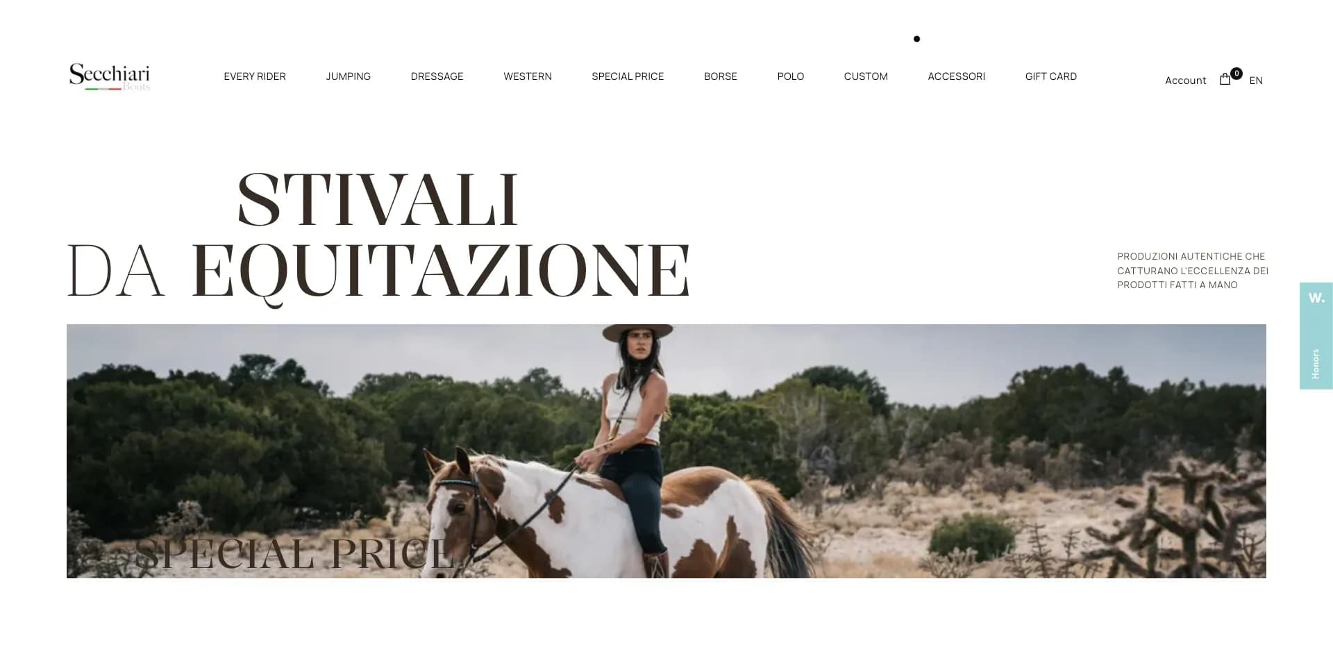
An editorial ecommerce homepage for handcrafted equestrian footwear, balancing an austere white retail interface with cinematic horse-and-rider photography, oversized fashion typography, product merchandising and an atmospheric image-led footer.
Prompts
Main build prompt
Build a long-form luxury equestrian ecommerce homepage whose signature is a white, gallery-like sequence of oversized high-contrast serif display words and cinematic horse-and-rider photography. Use the following dimensions and timings as reconstruction targets inferred from the reference, not exact measurements of the original implementation. Design around the 1920×968 (approximately 1.98:1) desktop presentation frame, with a #fefefe paper-white page, #1a1a1c body ink, #3b332e dark-brown display ink, #e4e4e5 merchandise-panel gray, #c4c3c3 ghost display type and a single #a4d2e5 fixed utility-tab accent.

Use Kalnia for display headings and Manrope for navigation, product labels, prices, small body copy and utility UI. On desktop, make the header roughly 92–105px tall with a small own-wordmark at left, about 9–11 concise collection links across the center, and account, bag and language utilities at right. Keep it white, flat, quiet and densely aligned; text is roughly 10–12px. Include a narrow fixed right-edge help/contact tab in pale cyan, vertically oriented and about 50–60px wide. It should remain visually secondary.

Give the hero a large two-line serif heading at roughly 72–92px with a tight ~0.9–1.0 line height, occupying the upper left/center. Place a compact uppercase-ish provenance statement at the right of it. Beneath, place a wide 1.98:1 campaign carousel within approximately 60–65px page gutters. Overlay each slide with one large serif collection word, a tiny descriptor and a thin outlined circular arrow. Use original category names and original copy. The hero media must be authentic-looking generated or commissioned photography of riders, boots and horses, not stock-template lifestyle imagery. Cycle among several scenes with materially different crop and subject placement.

After a generous roughly 250–360px breathing pause, introduce a full-width, overscaled repeating serif phrase in pale gray; it should run beyond the viewport edges in two or three horizontal lines and function as an atmospheric typographic field, not readable content. Layer a normal-scale “new arrivals” label and a two-up merchandise rail in front of or directly beneath it. Each product panel is about 50% width minus a 16–24px gap, with square corners, a #e4e4e5 ground, centered transparent-background product render, small lower-left name and lower-right price. Use only two products in the visible row and simple left/right arrows at its outer edges. Do not add rating stars, discount badges, add-to-cart buttons, rounded cards, a generic feature grid or a promotional ticker.

Continue with a spacious brand-story composition: a left text column around 30–35% width and a taller documentary image at right around 50% width. Let a short paragraph be centered in the left column. Use a second, faint duplicate paragraph behind or near it only as an understated motion/overlay treatment. Follow with an offset vertical detail photograph on the left and a short right-side paragraph in which a pale-gray text layer and dark active text can overlap. Preserve large white voids; the page should feel curated rather than densely informative.

Place a broad 1.98:1 outdoor action image lower down, centered and narrower than full page width. Follow it with category navigation made from enormous stacked dark-brown serif words, around 150–220px on desktop and deliberately cropped at page edges. The typography is an image-scale navigation device. Then use another repeating pale-gray serif word band to introduce a testimonial region: left-side stacked portrait prints, slightly fanned and offset like a small physical photo pile, alongside a compact serif name and a two-line quote. Use generated or commissioned rider portrait imagery; do not reuse source campaign images or brand identifiers.

Finish with a tall, full-width photographic footer at approximately 1.98:1, using a dark #3b332e/brown translucent overlay over an evening equestrian scene. Set small contact and payment areas toward the left, two link columns toward the right, and center a newsletter block with own logo, serif heading, underlined email field, arrow submit control and required-consent line. White text should be restrained and legible. Use semantic header, nav, main, section, product-list, article and footer landmarks; give every useful image descriptive alternative text, maintain visible keyboard focus and label the carousel controls and email input.

Implement the visual composition with normal DOM, CSS Grid/Flexbox, responsive images and SVG icons. Use a slider library for the hero and a motion library only for transitions and reveal choreography; canvas/WebGL is unnecessary. Serve responsive AVIF/WebP images with a fallback, preload only the opening hero image and reserve image dimensions to prevent layout shift. Respect reduced motion with a static first hero image and immediate but subtle content visibility. The entire system must remain flat, typographic and editorial: no glossy gradients, heavy shadows, glass panels, pill UI, loud animations, testimonial carousel, chat bubble or generic SaaS-style sections.
Create a free account to unlock all prompts
These prompts describe a visual language: composition, rhythm, type scale and motion. Build with your own branding, copy, logos and imagery — the design and content of Secchiari Boots belong to their authors.
Build Recipe
Framework
- Shopify· Detected
- Shopify
Creative tools
- Nano Banana
- Krea
Libraries
- GSAP· Detected
- Swiper· Detected
- GSAP
- Swiper
Special requirements
AI Replicability
88 / 100
Main remaining challenge
The design and branding of Secchiari Boots belong to their authors. InspoToCode documents its visual language as a reference; anything you build from it should carry your own branding, copy and assets.
Design analysis
- Square, editorial edges throughout; use 0px on imagery, product panels, fields and controls. Circular outlines appear only for small directional arrow affordances.
- Mostly typographic text links and minimal line-arrow controls. Keep controls compact, flat and unfilled; no pill buttons or prominent filled CTAs.
- Two large, square-ish pale-gray merchandise panels with a centered cut-out product image, item label at lower left and price at lower right. No card radius or floating-card shadow.
- Almost none. Product and editorial imagery sit directly on the white ground; retain only natural shadow inside source photography or product cut-outs.
- Very fine dark rules on form fields and circular arrow buttons. Avoid boxed navigation and decorative dividers.
- Expansive editorial whitespace: section pauses are roughly 140–300px, while utility text uses compact 12–24px relationships. Let oversized headings break the grid deliberately.
- Desktop content is inset around 60–65px for top navigation and broad modules; selected editorial images are narrower, approximately 50–75% of the page width, to create asymmetric whitespace.
- A slim single-row header with logo left, many compact uppercase-ish category links centered, then account, bag and language utilities right. A narrow fixed vertical cyan support tab rides the right edge.
- Warm, authentic equestrian editorial photography: riders, horses, leather boots and tack, with rugged outdoor light. Mix wide horizontal action scenes, tall documentary portraits and clean isolated product imagery on cool-gray grounds.
- No designed gradients in main content. The footer uses a dark translucent brown overlay over a full-bleed photographic background for legibility.
- A long, deliberately sparse editorial sequence: header and carousel hero; oversized repeated background type behind a two-up product rail; offset text/photo story blocks; a broad landscape image; enormous stacked category words; testimonial collage; photographic newsletter footer.



