Special Production Agency
specialproduction.agency
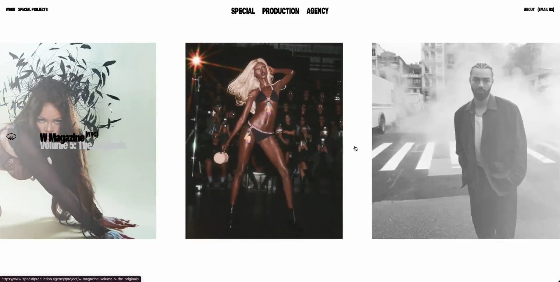
- Large type
- Animation
- Minimal
- Light
- Editorial
Palette
Typography
Primary
displayBlackSecondary
ui-sans-serif
About this design
A fashion and culture production agency portfolio that turns project browsing into an oversized, kinetic editorial gallery. Sparse interface chrome gives high-production imagery room to dominate, while each transition changes the scale and rhythm of the entire viewport.
Prompts
Main build prompt
Use the following dimensions and timings as reconstruction targets inferred from the reference, not exact measurements of the original implementation. Build an image-led agency portfolio at the observed 1920×968 (≈1.98:1) desktop stage. Its signature is a vast near-white field interrupted by oversized, laterally moving editorial photographs: the user should feel as though they are looking through a living contact sheet rather than a conventional project grid.

Set the base to #fcfcfc with charcoal #1c1c1a typography. Place a thin, fixed top bar at roughly 14–18px from the top and 10–18px from each side, above all imagery. At left place two compact all-caps text links; center a three-word placeholder wordmark in a heavy, extra-condensed display face; at right place two more short utility links. Render this chrome at around 10–15px on a 1920px screen, tight line-height, black, with no pills, borders, icons, or filled buttons. Use your own wordmark and labels.

Below the header, create a wide project rail beginning around 78px from the top. The overview sequence is deliberately asymmetric: show 3–4 image panels across at once, with a dominant central landscape panel roughly 640px wide by 360px high, flanked by narrower portrait and medium landscape panels. On later states, rearrange this into a tall portrait, a near-square editorial photograph, and a broad monochrome landscape. Use gaps around 50–65px, but let the first and last panels crop off the viewport edges. Do not constrain work inside a centered max-width grid. Add a compact two-line project label directly over or immediately beside the active image: heavy condensed title on top, a lower-contrast supporting line beneath. A small vertical run of numbered markers may sit beside the active panel.

Use substitute imagery only: generate or commission original high-fashion editorial photographs featuring diverse adult models, beauty product stills, studio jewelry portraits, backstage scenes, and moody city portraits. Prepare each image with intentional crops rather than generic stock-image framing. The overview should mix desaturated cool street imagery with warm studio fashion and black-and-white portraits. Do not use original names, campaign art, logos, or copy from the reference.

A selected project should enter a detail mode that replaces the overview with a large, horizontally advancing poster rail. Each poster is approximately 360–450px wide and 450–560px high at desktop, with 24–40px gutters and neighboring posters visibly cut by both viewport edges. Design a coherent original luxury editorial series: use large elegant serif campaign lettering across the top of every poster, an outlined octagonal or faceted frame around a centered model, and varying pastel/pale backgrounds such as soft pink, buttery yellow, and saturated green. Put a tiny centered thumbnail strip near the bottom, with roughly 6–8 miniatures and a clear active state. Keep this as an authored campaign treatment made from original styling, not an imitation of a known brand.

For reconstruction, use semantic DOM images or background layers plus CSS transforms; canvas and WebGL are unnecessary. Use object-fit: cover and per-image object-position values so the crop remains art directed. Keep the header at a higher stacking level than the overview but allow the detail gallery to use the whole visible field when its composition demands it. Preload only the active image and immediate neighbors; defer distant panels and reserve their dimensions to eliminate layout shifts.

Animate the overview as a continuous or stateful lateral composition: panels should translate sideways, with the active project label changing as panels reach prominence. Make movements smooth and editorial rather than bouncy, roughly 700–1200ms for a project transition and around 4–7 seconds of held reading time if auto-advancing. Detail posters slide horizontally at a steadier pace and may be navigated by hover, drag, arrow buttons, keyboard arrows, and thumbnail selection. Preserve click/tap access to each project; do not make essential content depend on hover or autoplay.

On smaller screens, preserve the oversized-image idea as a single-column or one-and-a-bit horizontal rail with large swipe targets, a compact header, and readable labels. Respect prefers-reduced-motion by showing a stable active project with manual next/previous controls. Provide useful image alt text describing the substitute subject and treat all links and carousel controls as keyboard-accessible. Do not add a hero slogan, service-feature grid, floating decorative shapes, rounded cards, drop shadows, testimonial carousel, gradient backdrop, or generic agency boilerplate; the restraint and the kinetic crop system are the design.
Create a free account to unlock all prompts
These prompts describe a visual language: composition, rhythm, type scale and motion. Build with your own branding, copy, logos and imagery — the design and content of Special Production Agency belong to their authors.
Build Recipe
Framework
- Next.js· Detected
- Next.js
Creative tools
- Nano Banana
- Recraft
Libraries
- GSAP
Special requirements
AI Replicability
83 / 100
Main remaining challenge
The design and branding of Special Production Agency belong to their authors. InspoToCode documents its visual language as a reference; anything you build from it should carry your own branding, copy and assets.
Design analysis
- No visible component rounding; the white page has subtly rounded outer viewport corners.
- Navigation is rendered as terse all-caps text links rather than outlined or filled buttons.
- There are no conventional cards. Projects are raw rectangular image panels, often deliberately cropped by the viewport edge.
- No decorative shadows; depth comes entirely from photographic content and overlapping/cropped panel placement.
- No visible dividers around images or controls. Use whitespace and hard image edges for separation.
- Extremely generous empty field above and around the moving work, with tight all-caps navigation and labels.
- Full-viewport composition. Header items align near outer edges while the project panels deliberately exceed the viewport width.
- Compact uppercase navigation sits across the top; a centered three-word masthead anchors the desktop composition.
- High-fashion editorial photography, mixed aspect ratios, hard crops, occasional muted treatment, and a campaign detail view with bold product art.
- No interface gradients. Any tonal transitions belong to the source photography.
- A fixed top navigation overlays a wide kinetic project rail. Portfolio overview uses staggered, unequal image widths; detail mode becomes a horizontally advancing sequence of tall campaign posters.



