Structured — Daily Planner
structured.app
Productivity
- Animation
- Large type
- Light
- Minimal
Palette
Typography
Primary
InterSecondary
Inter
About this design
A consumer productivity app landing page presented as a continuous, full-viewport feature reel: warm editorial video gives way to pastel product demonstrations, oversized type, device renders, and a soft social-proof finale.
Prompts
Main build prompt
Build a desktop-first productivity-app marketing page whose identity is a continuous, full-viewport editorial product narrative: a pale blush stage, a floating smoky-glass navigation pill, oversized blue-grey messaging, and isolated device renders presented across successive scroll sections. Use the following dimensions as reconstruction targets inferred from the reference, not exact measurements of the original implementation. Frame the primary desktop experience in the reference 1920×968 (~1.98:1) composition; every full-bleed video/poster asset should preserve that ratio, such as 2560×1290 or 3840×1936.

Make the page a sequence of approximately 90–100vh scenes on #fae1e4 or #fa9897, with no visible section-card scaffolding. Keep a persistent header about 44–52px high, inset roughly 120px on wide screens and ~8px from the top. It is a long pill with translucent charcoal/rose glass, background blur around 12–20px, a soft broad shadow, an original circular symbol plus your own wordmark at left, compact small navigation links centered, and a muted denim #567798 pill CTA on the right.

Use Inter if verified from the reference; otherwise choose a clean neutral grotesk with similar proportions. Use approximately 400–700 weights. Main statements are roughly 50–62px on desktop with tight ~1.03–1.1 line-height; emphasize selected words in 700 while surrounding words use 400. Use blue-grey rather than pure black for hero type.

Open with an atmospheric, warm, high-resolution café/studio video shot with people at work and natural afternoon light. Let it fill the opening stage beneath the header with a dark translucent treatment only if needed for legibility. Use original or licensed footage rather than reference material.

Continue into a salmon-pink scene with a large landscape tablet centered around the lower half, surrounded by faint stationery props. Follow with a centered headline and a low horizontal run of playful illustrated metrics/pictograms. Continue with a near-empty blush scene, a large centered two-line headline, and a vertically oriented phone mockup below it.

The core sequence is a series of minimal product scenes encountered as the user progresses through the page. Use left-copy/right-device composition where appropriate: copy occupies roughly 40–54% of the stage width, beginning around x=13–16vw and vertically centered; the active device sits on the right around x=59–74vw.

Show the product progressively across different hardware contexts:
- a tall phone with a fictional vertical time-block planner;
- a laptop displaying the same planning system;
- a smartwatch or compact wearable view.

These should be treated as distinct scroll sections or scene states. A reconstruction may animate transitions between them, but do not assume that the original site automatically replaces one device with another in a timed sequence unless that behavior has been independently verified.

If motion is added, a previous device may briefly remain as a very low-opacity visual ghost during the transition, but this is an optional reconstruction technique rather than a required characteristic of the reference.

Use photorealistic transparent PNG/WebP renders or carefully constructed SVG/CSS bezels, but never use real product screenshots or branded interface assets. Create a clean fictional schedule with colored vertical task pills, calendar dates, circular completion marks, and compact labels.

After the product scenes, use a centered multi-line typographic cloud roughly 56–66vw wide: short benefit phrases mixed with emoji-style symbols, with upper phrases in higher-opacity blue-grey and lower phrases progressively faded toward the pink ground.

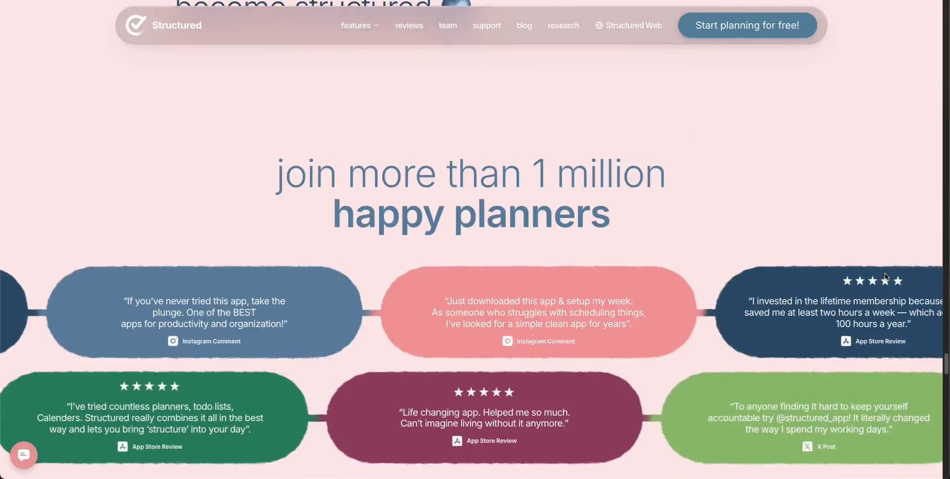
End with a centered two-line community heading and a loose 3-by-2 field of oversized organic testimonial capsules in denim, coral, green, berry, and pale green. These should feel like chunky soft blobs, not rectangular cards. Set concise white quotation text and a subtle source line inside.

Use semantic header/nav, main, section headings, buttons, and accessible text. Provide a visible keyboard focus ring, pause or avoid autoplay video for reduced-motion users, and ensure CTA/link contrast remains legible on the translucent header.

Use native video plus standard DOM, CSS transforms, SVG, and image assets. A practical reconstruction may use GSAP for coordinated scene transitions, but the page should remain understandable as normal scrollable sections without animation.

Optimize video with a poster, metadata preload, and an image fallback. Do not add a SaaS feature grid, pricing table, testimonial carousel controls, gradients, glossy 3D blobs, dense icon cards, or conventional boxed panels. Blank space, typography, pink fields, and isolated product hardware should remain the defining visual language.
Create a free account to unlock all prompts
These prompts describe a visual language: composition, rhythm, type scale and motion. Build with your own branding, copy, logos and imagery — the design and content of Structured — Daily Planner belong to their authors.
Build Recipe
Framework
- React
Creative tools
- Nano Banana
- Recraft
Libraries
- GSAP
Special requirements
AI Replicability
87 / 100
Main remaining challenge
The design and branding of Structured — Daily Planner belong to their authors. InspoToCode documents its visual language as a reference; anything you build from it should carry your own branding, copy and assets.
Design analysis
- Navigation and CTA use fully pill-shaped ends; testimonial capsules are deliberately irregular, organic rounded rectangles rather than uniform UI cards.
- One prominent muted-blue pill CTA with white text; compact text links remain low-emphasis in the translucent nav.
- Avoid standard cards. Product interfaces live inside realistic device silhouettes; only the final social-proof messages form large soft capsules.
- Soft, broad, low-opacity charcoal shadows under the floating nav and device renders; never crisp elevation shadows.
- Very little structural bordering. Device bezels are near-black; the header is separated chiefly by translucency and shadow.
- Extremely spacious full-screen stages. Type and device imagery occupy separate halves, with large intentional areas of empty pink ground.
- Wide desktop composition within the 1920×968 reference stage; the header is inset roughly 120px from each side while hero content uses a narrower centered or two-column frame.
- A translucent smoky glass pill floats at the top, carrying a compact logo area, small centered links, and a blue CTA at the far right.
- Begin with warm cinematic lifestyle footage, then use high-resolution isolated device renders showing a coherent fictional scheduling interface. Later sections use simple emoji-like pictograms and colored testimonial capsules.
- No decorative multi-stop gradients. Apparent tonal variation comes from translucent glass, photographic light, fading device ghosts, and crossfades.
- A fixed floating header overlays a succession of near-viewport-height scenes: centered tablet, centered phone, left-copy/right-device pairings, a text cloud, then testimonial capsules.



