Ten Years Away
ten.375.studio
Creative Studio
- Animation
- Dark
- Editorial
- Minimal
- WebGL
Palette
Typography
Primary
valveSecondary
Times New Roman
About this design
An interactive comic-book chronicle that moves from a dark, oversized date title and illustrated cover into a bright, horizontally drifting sequence of framed narrative panels.
Prompts
Main build prompt
Build an original interactive comic-story experience whose signature is a vivid, tactile illustrated book cover suspended inside a dark title stage, then a click-driven passage into a bright, horizontally travelling field of comic panels. Use the following dimensions and timings as reconstruction targets inferred from the reference, not exact measurements of the original implementation. Design the primary desktop scene for 1920×968 (≈1.98:1), and preserve that stage ratio for any WebGL render surface or offscreen cover treatment.

Begin with an almost black blue-grey ground (#212635) with low-contrast paper grain and cloudy tonal movement. At the top centre place a tiny pale utility message; put a small progress/instruction line at bottom centre. Set one enormous uppercase, condensed sans headline across the top edge, around 110–155px on this desktop target, pale blue-white (#dbdde3), bold, tightly tracked, and deliberately cropped by the viewport. Add a small three-line introductory note at upper left, a short italic serif aside at upper right, a thin vertical line near the right edge, and huge outlined years along the bottom left and right. The outlined numerals should be roughly 110–145px, transparent inside, with a 1–2px pale stroke. Keep this stage sparse and atmospheric.

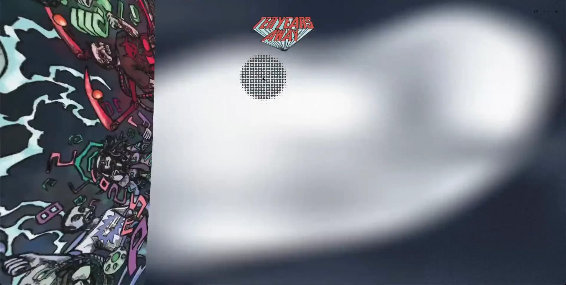
Center an original illustrated portrait-format comic cover approximately 310–360px wide and 450–535px tall. It needs dense, energetic hand-drawn linework, halftone fields, muted teal/pink/red/ochre accents, and an original angled title mark integrated into the artwork. Source it by commissioning an illustrator or producing your own artwork; do not use a real publication’s drawings, characters, logos, or copy. Give the cover roughly 15–30px of soft black shadow and a faint perspective tilt. Make it the only saturated object against the dark field.

On entry, let the oversized surrounding typography and timeline annotations withdraw while the cover enlarges into a near full-height portal. Transition into a near-white #f5f6f9 story space with a subtly mottled paper texture and cool grey #c5c4ca atmospheric patches. A narrow top navigation remains fixed: tiny black uppercase links at far left, small language/audio controls at far right, a compact original illustrated diamond-like masthead in the centre, and hairline horizontal rules extending out from it. Keep a one-line project descriptor bottom centre and a tiny studio credit bottom right. Use your own labels and narrative copy, not source wording.

The main reading surface is not a vertical card grid. Position separate, black-outlined comic frames in a large horizontal world, typically 280–570px wide and 180–300px tall, leaving huge white negative space around them. Populate them with original monochrome sequential drawings: collaborators at desks, a close view of a computer display, a local sports court, or similarly personal work-and-life scenes. Use off-black hand ink, pale grey washes, speech balloons, a small single-colour monitor glow, and a separate halftone-dot disc as a graphic counterweight. Panels should look physically placed, with very soft shadows; retain rectangular frames and modest irregularity in placement, not a neat masonry system.

A practical recreation is a full-viewport DOM shell with a WebGL canvas behind or above it only for the cover’s perspective/depth transition and paper-like ambient treatment. Use CSS/SVG for navigation, rules, labels, outlines, panel borders, and halftone dots. Drive the story journey with a controllable horizontal world transform: wheel, trackpad, drag, arrow keys, and a visible start affordance should all advance it. Smoothly interpolate movement rather than forcing native horizontal scroll. Ensure normal keyboard focus remains possible and offer a clear ‘enter story’ button with an accessible name.

At the desktop target, retain generous empty space; panel composition matters more than showing many panels at once. On touch screens, adapt the experience to vertical swiping while maintaining the same panel order and the fixed masthead. Use semantic buttons, links, labelled navigation, sufficient contrast for small labels, and descriptive alt text/transcripts for each narrative panel. Respect reduced motion by replacing the portal fly-through with a quick crossfade and using discrete panel-to-panel movement. Preload only the cover and first two story images; defer subsequent art, cap texture DPR on low-power devices, and use a static CSS paper field if WebGL is unavailable.

Do not add a generic hero CTA cluster, feature cards, testimonials, rounded UI pills, bright gradient blobs, a conventional marketing footer, or dashboard-like chrome. The experience must remain an authored comic environment: quiet labels, large empty paper, inked frames, and one dramatic passage from cover to story.
Create a free account to unlock all prompts
These prompts describe a visual language: composition, rhythm, type scale and motion. Build with your own branding, copy, logos and imagery — the design and content of Ten Years Away belong to their authors.
Build Recipe
Framework
- Next.js· Detected
- WordPress· Detected
- Next.js
Libraries
- Three.js
- GSAP
Special requirements
AI Replicability
78 / 100
Main remaining challenge
The design and branding of Ten Years Away belong to their authors. InspoToCode documents its visual language as a reference; anything you build from it should carry your own branding, copy and assets.
Design analysis
- Square, printed-edge geometry throughout; panels have roughly 0–3px corner rounding at most.
- Tiny text controls and compact language toggles, without filled pills; use underlines, rules, and opacity changes rather than conventional buttons.
- Do not use product cards. Narrative content is presented as individually framed comic panels with dark ink outlines and sparse cast shadows.
- The cover and comic panels cast soft, low-contrast charcoal shadows, roughly 18–35px blur, to imply objects hovering above the field.
- Hairline pale rules on the dark intro; comic panels carry approximately 3–5px black drawn borders on the light reading stage.
- Extremely spacious wide-screen composition. Small editorial annotations sit in large empty areas while major display type bleeds toward viewport edges.
- Full-bleed 1920×968 (≈1.98:1) stage. Header items align close to the outer edges; story panels intentionally escape a conventional centered content container.
- A restrained top editorial strip: small links at left and right, centred illustrated masthead, and thin rules extending horizontally from it.
- Use newly commissioned or original hand-drawn comic art: expressive black linework, halftone dots, restrained grey wash, and occasional muted colour accents; never substitute generic stock photography.
- Subtle cloudy, grainy tonal variation in both dark and light grounds; avoid glossy digital gradients.
- A dark cover reveal is vertically centered and framed by giant cropped display lettering and outlined years. The reading mode becomes a light, broad canvas with scattered panels traversing horizontally.



